BIT-101
Bill Gates touched my MacBook Pro
At the end of my post about color palettes I talked about extracting palettes from images. I said there that I’d gone through a few different strategies but wasn’t really satisfied with any of them. And I said that I wanted to try k-means clustering to see if that would have better results. I implemented k-means a few months back on 2D points and got it working pretty well, but for some reason I thought that doing it with colors would be a lot more complicated. Turns out, it was pretty easy to adapt the 2D clustering code to 3D - where the 3 dimensions were red, green and blue.
The k-means algorithm helps you find “clusters” in data sets. For example, say you have a set of coordinates where crimes have happened over a city or state. You can plot them on a map and maybe get a visual idea of where the worst crime locations are. There might be three or four hot spots. k-means is just an algorithmic way of doing that.
Say you have the following points mapped out.
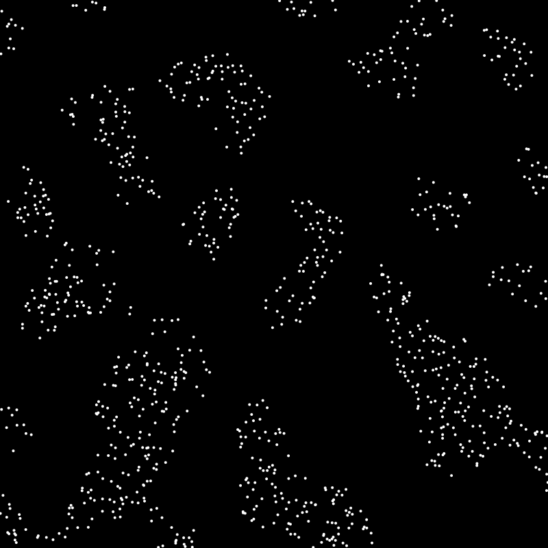
You can visually see that there are clumps or clusters where there are more points, but how would you go about identifying those? If you’re not familiar with k-means, think about how you might do that for a bit.
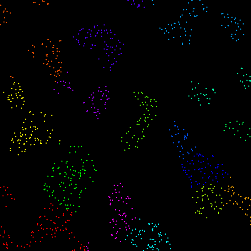
k-means gives us the following 16 clusters, each color coded:
Here, I’ve drawn a circle at the center of each cluster. Each point is assigned to the cluster where it is closest to the center. That’s where the name comes from. Each cluster is formed by an average or “mean”, and there are a specific number of them - k. So you have k means.
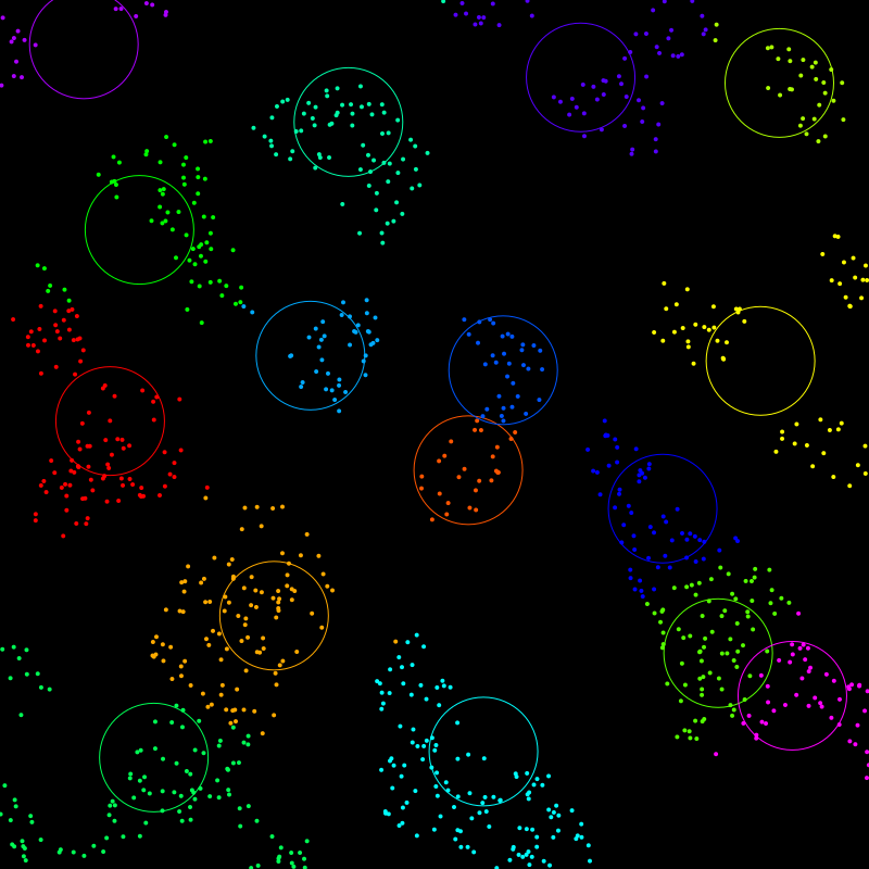
Now, you might not agree with some of those clusters. For example, that yellow cluster on the right edge, you might be thinking that should be three separate clusters. The thing is, k-means requires you to set a value for how many clusters you want to sort your data into. I chose 16 and it did its best with that. If I specify 28 clusters, we get this:

Now, it got three different clusters for those ones on the right, but maybe there are others where you feel that two or more clusters could be joined. The takeaway is that the algorithm is very dependent on the initial number of clusters you specify and you may not always get the results you expect.
There are more advanced features that people have added to the algorithm over the years, but this is just the original basic algorithm.
To start with, you create k means, i.e. you create a specific number of “centroids” (in this case 2D points), which will eventually become the centers of each cluster. So again, you have to choose how many means you want. For this discussion, let’s say we choose five. So we create five points to serve as centroids.
Then, we have to decide how to create these centroids. Where do we put them? Well, there are various strategies for that. The simplest is to just create random points that will fit within the range of the data. That generally works surprisingly well, though there can be some differences in the outcomes on different runs. It can also have some other problems we’ll explore later. But often it’s a good enough strategy. Other strategies involve some randomness but making sure that your centroids are spread around the data set and not randomly clumped together.
Now that you have your five centroids, you loop through all the data points and assign each one to one of five clusters based on the five centroids. You find out which centroid each point is closest to and assign it to the cluster associated with that centroid.
Now you have five clusters, but they are probably not optimal, especially if you chose random centroids. So, you go through each cluster and find the mean location of each one of them - the average location of all the points. In most cases, this new mean will be different than the existing centroid. So you take those five new means and make them the new centroids for five new clusters. And you loop through the points again and assign them. You’ll likely have different assignments.
And you repeat that over and over - assign the points, get the new means, assign the points, etc. - until the new means are the same as the previous means. This means things have stabilized and you now have your final clusters.
As I said, this was much simpler than I expected.
First I gather all the pixels in the image. Each one has red, green and blue values from 0.0 to 1.0. Maybe you want to use 0 to 255. But these three values let you think of a color as a point in 3D space.
Then you decide how many colors you want in your palette. Again, lets go with five. You create five centroids, which themselves are color values.
Now you loop through all your pixels and find out which centroid they are closest to. This again is Euclidian difference. You take each pixel and get its difference to the centroid on the red, green and blue “axes”, call them dr, dg, db. Then it’s just sqrt(dr * dr + dg * dg + db * db). (See note on this later.)
Then you get the average color of all the pixels in each cluster. Again, this is adding up all their reds, greens and blues and dividing each by the number of pixels in that cluster. Those are your new means and you repeat until the means don’t change.
Now, each of those means/centroids are an average of the pixels in that cluster, meaning that list of centroids is your sampled palette!
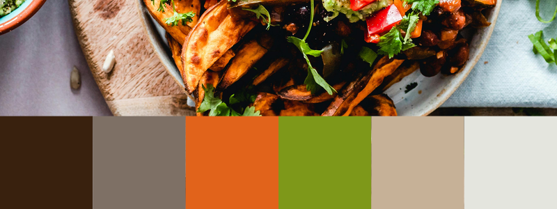
Say we start with this image:
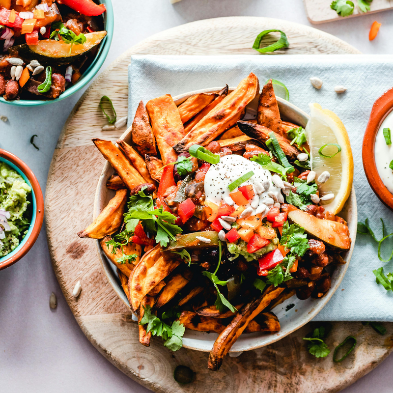 Photo by Ella Olsson: https://www.pexels.com/photo/top-view-of-food-1640772/
Running through this algorithm, we get the palette shown on the bottom of the image:
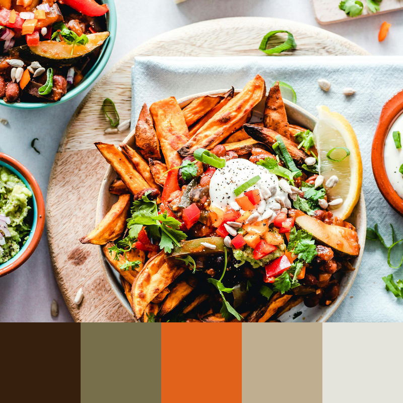
I think this has done a pretty good job. It’s got the dark brown, then the mid brown with a hint of green, the reddish orange, a lighter brown and an off-white. It didn’t really grab the green in this case, but if we up the palette to a count of six, we get it.
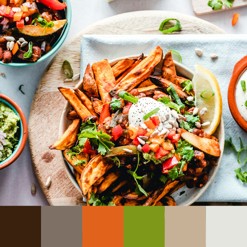
Interestingly, that second mid-range brown now seems to have less of a green tint. The green pixels got pulled into their own cluster, leaving that one just plain brown.
I built a standalone tool that you can run as a command line app. You can find it here: https://codeberg.org/bit101/getpal. There are binaries for MacOS and Linux, though I think you’ll need to install the cairographics library for your platform as well.
But before I built the tool, I built all the code to let me do this within anything I happen to be coding at the time. Here are the pieces that go into it:
A function to get a list of all the pixels in an image. I can do that by loading an external image or grabbing the pixels from the drawing context of an image I am working on. This just returns an array with an RGB value for each pixel. For an 800x800 picture, this is an array with 160,000 elements. For a much larger image, this could get out of hand. So the function lets me set a sampling resolution. If I set that to 4, it will sample every fourth row and column, in other words, one pixel for every sixteen. This speeds things up a lot but still usually gives you a good representation of the color values. The code for all of this is here: https://codeberg.org/bit101/blcairo/src/branch/main/context_histogram.go
The k-means function itself. This takes the array of pixels and a k value - how many colors you want in the palette. This returns the palette as an array of color values, to use as you will. If you want to gaze at the code, it’s here: https://codeberg.org/bit101/bitlib/src/branch/main/blcolor/kmeans.go
There are some nuances though…
Initially I was, as described earlier, just creating random color values for the initial centroids. This had mixed (and not very stable) results. You could get different palettes each time you ran the tool. Usually pretty close, but there would be differences. Sometimes things would be way off. I ran across an example that showed very clearly how random centroid initialization can get you into trouble, and reproduced it here.
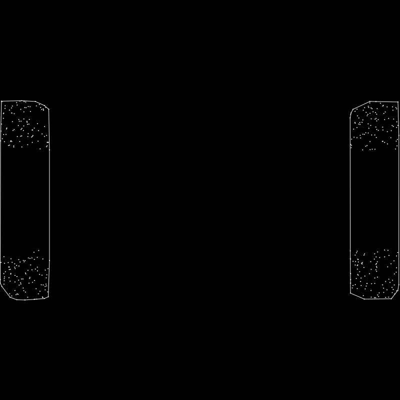
Say you have a random set of values that are naturally clustered together like so:
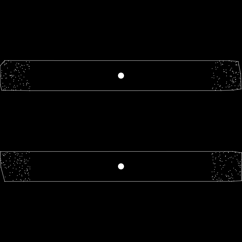
And say you wanted to extract two clusters from this. You would expect the algorithm to group them as so:
But say your initial two centroids were placed near the center like this:
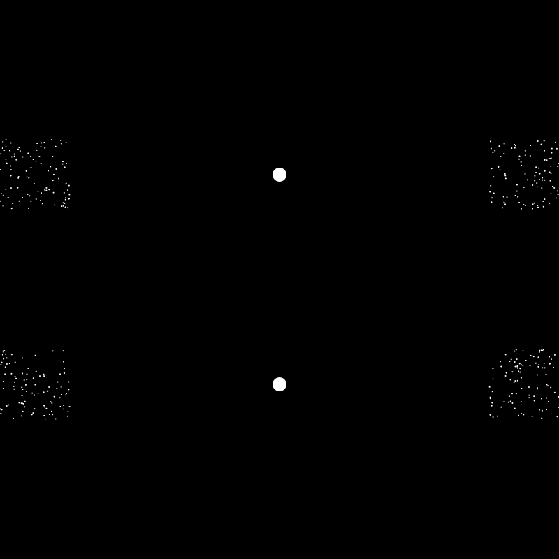
Then k-means would return the clusters defined like this:
That looks ridiculous, but all the points in the top cluster are closest to the top centroid and all the ones in the bottom are closest to that centroid, so it’s stable and correct! There are other configurations which would cause other similar problems.
So random centroid initialization can give you random problems. And I would see some odd results now and then when using random RGB initial centroids. In fact, it’s surprising how well it worked most of the time with random initialization. But I wanted to see if I could do better.
Ideally you’d want your initial centroids spread throughout the data. Of course, they’ll change and move around as the algorithm iterates, but you tend to get better results if they are spread out to start with.
I came up with a seemingly well-working strategy using HSV. If I want five colors in my palette, I initialize the centroids with HSV colors where the hue ranges from 0 to 360, like 0, 72, 144, 216, 288. Since a hue of 0 is the same as 360, this ensures that each centroid’s hue is 72 degrees from any other one. Of course, this is done mathematically based on the number of palette colors specified. I used a saturation and value of 0.5 for each color as well. That just seemed to work the best.
I’m pretty happy with how this worked out. It seems to capture those less represented colors, like the green in the above photo, better than the random method for the most part.
You can use the color value of the centroid as final palette color for that cluster, which is what I did at first. It generally works OK, but realize that is not necessarily a color that is actually in the original image. It’s an average of all the colors in that cluster. If you have a bunch of colors around the centroid, but none exactly near it, you could wind up with a color that doesn’t seem to fit at all. So I gave myself three options here:
Take the average as described above. This is deterministic, meaning you should get the same color each time.
Take the pixel from that cluster that is closest to the centroid. This is guaranteed to be an actual color that exists in the image, and again is deterministic.
Take a random pixel from that cluster. This is guaranteed to be a color in the image, but is non-deterministic.
When you run the tool, you pass it the path to an image it will spit out a comma-separated list of color values. You can also specify the number of colors in the palette with the -n flag. This defaults to 5.

You can use the -s or --swatch flag passing it the name of a new png to create, which will visually show you the palette it extracted. Running getpal -n 8 -s palette.png for example, generates this image:

By default, it will sample at a resolution of 4 as described above. You can change this with the -r flag. But pay attention to the fact that setting this to 10 for example would not sample every tenth pixel, but every tenth row and column, so every one-hundredth pixel, which is starting to get into the realm of missing some color values, for a smaller image at least.
Finally, the -m or -method flag lets you specify the method of choosing the final color for each cluster as just described, the values are “average”, “closest” and “random”, with “average” being the default.
As analytical as all of this is, it’s not hard science. Some things to realize:
As seen in the photo example above, and as described earlier, the number of colors you specify can have a very big effect on the palette you get. If you’re hoping to get a particular color in the palette, you might have to specify a larger palette and manually cull some of the colors you don’t want.
The method argument can play a big part in fine tuning the palette you want.
RGB is useful way of mathematically specifying color values, but it does not map perfectly onto human color perception. We see some colors as brighter or dimmer than others even when they have the same value. Some colors stand out to us more than others. The contrast between neighboring colors can change our perception of a given area of color. Like in one of my favorite optical illusions.
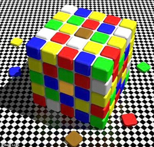
The brown square in the center of the top face of the cube and the yellowish square in the center of its left side are actually the same color! You might be frustrated trying to find that yellow in the palette, and only seeing the brown emerge.
There are other color spaces that attempt to adjust for these perceptual differences. To keep things simple, I did not implement any of those. But to help a little bit, I use a distance function that calculates the perceptual distance between two colors, rather than the raw RGB distance. I don’t know how much it actually helps in the long run, but I left it in there.
In no way is this meant to be a definitive “these are the exact five colors that most represent this image” type of tool. I don’t even know if such a thing is possible. But it does pretty damn well, in my estimation, on grabbing a number of colors out of the image that seem to fit. Far, far better than all the other methods I’ve tried. Use it more as an inspirational tool, grab more colors than you need and choose the ones you like the best, play around with it.