I’ll keep this brief. I’m leaving Twitter after 16 years. A tough decision. 8000 followers. Lots of history. It was an overwhelmingly positive experience. But the platform is in a very different place now and I just don’t want to have any connection to it going forward. I’ll disable my account some time on December 13, 2022 probably.
I’ve flirted with Mastodon for several years now. There is now a critical mass of people I know there. I’m having a great time there and it feels very much like the early days of Twitter. Good conversation, good creativity, low drama.
I met so many people and maintained so many good relationships on Twitter. I hope to continue to stay in touch with a lot of you, either here, on Mastodon, or on other avenues.
I’ll admit that when I started brainstorming this chapter, I began to second guess the decision to include it at all. The curve we’ll cover here, the parabola, is fairly simple, basic, even plain compared to the crazy curves we’ve been generating in the last three chapters. But as I got into it I realized that this curve is pretty cool and has lots of interesting properties. In fact, I was going to cover another curve, the hyperbola, in this chapter as well, but I got so deep into parabolas that I decided to save hyperbolas for another time.
Parabolas
Just to make sure we’re on the same page here, this is what we’re talking about when we’re talking about parabolas:
One of the first things you’ll learn about parabolas is that they are a type of conic section. OK. But since we’re just doing two-dimensional curves here, their relation to a three-dimensional form is a bit irrelevant. But I’ll throw this image in here anyway and be done with the subject:
From https://en.wikipedia.org/wiki/Parabola
Since we’ve already covered circles and ellipses, this chapter and the next will fill out all of the conic sections. That was never a goal, but I’ll never pass up an achievement gained.
In the first picture above, note that the parabola is mirrored across the y-axis, and that the vertex (the highest or lowest point, depending on which way it opens) is just touching the x-axis.
As with most of these geometric shapes, there are various formulas used to describe them. Here’s a fairly simple and usable one:
y = a * x * x
In this case, a is a parameter that controls how wide the parabola opens up – and whether it opens on the top or bottom. So that’s pretty simple. Let’s draw one. But first, let’s set things up correctly and even create a couple of utility functions that will help us do so.
Set Up
As you can see in the initial image, we want the origin of the space to be in the center of the canvas so we can clearly see the parabola. So we’ll want to translate the canvas there.
Also, there’s a very good chance that your drawing api will be drawing things upside down, compared to normal Cartesian coordinates. In other words, y values will increase positively towards the bottom of the screen and negatively towards the top. So it will be good to flip it the other way around.
Finally, it will be nice if we can actually see the axes sometimes. We can create a function to draw them easily.
To center the canvas, you’ll use something like the following:
translate(width / 2, height / 2)
This is assuming your drawing api has transformation functions built in. It’s possible to do everything here without them, but it would be cumbersome to try to explain things twice, so I’m just going to assume that your drawing api, like most decent ones, does have transformation built in.
For the above, we can simplify that by making a center function:
function center() {
  translate(width / 2, height / 2)
}
As always, this is making the pseudocode assumption that your canvas or surface or whatever object you draw things on is a global object and you can just call these functions like that. Processing works that way, but for may other systems, these functions will be methods on a canvas object, so it might be more like
This keeps the x-axis as is, and flips the y-axis. I know, I know. Sometimes in this series I flip the canvas, other times I do not. Once again, these posts are meant to be practical drawing tutorials, not necessarily mathematically rigorous. So you should know how to flip the canvas and do it when and if you think you should.
Finally, I like to have a function around to draw the axes. For the purposes here, we can do something like:
This draws horizontal and vertical lines well beyond the bounds of the canvas, but that’s usually ok. It also sets the line width very low so it’s just a hint of a line, and then resets it to 1 when it’s done. In your actual function, you’ll probably want to do something like pushing and popping or saving and restoring the state of the canvas, so that your line width goes back to what it was before calling the function, which may not have been 1.
You might want to combine all that stuff into a more comprehensive setup function. Up to you.
Drawing the Parabola
Building on the last code we can now loop x from -width/2 to width/2 to go across the canvas from left to right. We’ll use a low value of a like 0.003 because we are operating on pixel values that are in the several hundreds. I just chose that value because it worked visually.
a = 0.003
for (x = -width / 2; x <= width / 2; x++) {
  y = a * x * x
  lineTo(x, y)
}
stroke()
And here’s our parabola:
If we change a to something larger, like 0.3, we get a much narrower parabola:
And something smaller like 0.0003, we get a much wider one:
Technically, a should not be 0 in the parabola formula. But if you do try it, you’ll just get a line. Then when a goes negative, the parabola opens up on the opposite side. Here’s -0.003:
And that’s all there is to parabolas.
Oh, no, wait. There’s a few more things!
Focus and Directrix
Parabolas have what is known as a focus point. That point is defined as:
x = 0
y = 1 / (4 * a)
Let’s draw that point:
a = 0.003
for (x = -width / 2; x <= width / 2; x++) {
  y = a * x * x
  lineTo(x, y)
}
stroke()

// draw focus
focusX = 0
focusY = 1/(4 * a)
circle(focusX, focusY, 4)
fill()
And it has another property called the directrix. This is a horizontal line where the y value is:
y = -1 / (4 * a)
We can draw that:
a = 0.003
for (x = -width / 2; x <= width / 2; x++) {
  y = a * x * x
  lineTo(x, y)
}
stroke()

// draw focus
focusX = 0
focusY = 1/(4 * a)
circle(focusX, focusY, 4)
fill()

// draw directrix
directrixY = -1/(4 * a)
moveTo(-width / 2, directrixY)
lineTo(width / 2, directrixY)
stroke()
What’s obvious here is that the distance from that the vertex to the focus is the same as the distance from the vertex to the directrix. Obvious because the formula for the y value of both is the same but reversed in sign.
But here’s an interesting fact – that statement of equal distance holds true for any point on the parabola! We can show that. Building on top of the last code sample…
lineWidth = 0.5
for (x = -width / 2; x <= width/2; x += 40) {
    // find a point on the parabola
	y = a * x * x
	circle(x, y, 4)

    // draw a vertical line from the directrix to that point
    // then from the that point to the focus
	moveTo(x, directrixY)
	lineTo(x, y)
	lineTo(0, focusY)
}
We sample the parabola at a number of points. We draw the point and then draw a line up from the directrix, and then over to the focus. Both lines emanating from each point will be the same length. You may not have a practical use for this straight off, but it looks neat anyway!
Tangent Line
Another thing you can do is find the tangent line at any point on the parabola. This will represent the slope of the curve at that point. The formula for the tangent at point x0, y0 is:
y = 2 * a * x0 * x - a * x0 * x0
This might be a bit confusing because we have x and x0. Again, x0 is a fixed point on the parabola. And x is one of the points the defines the tangent line. The formula gives you the y for that x. Let’s code that up for a single point on the curve. We’ll draw the parabola, then choose an x0, y0 point and use the formula to find two other points that make up the line.
// draw the parabola
a = 0.003
for (x = -width / 2; x <= width / 2; x++) {
  y = a * x * x
  lineTo(x, y)
}
stroke()

// find a point on the parabola
x = -80
y = a * x * x
circle(x, y, 4)
fill()

// find a point on the far left of the canvas
x1 = -width / 2
y1 = 2 * a * x0 * x1 - a * x0 * x0

// and one on the far right
x2 = width / 2
y2 = 2 * a * x0 * x2 - a * x0 * x0

// and draw a line
moveTo(x1, y1)
lineTo(x2, y2)
stroke()
And that gives us this point and line:
Now we can sample various points on the parabola (like we did above) and draw the tangent line for each.
lineWidth = 0.5
for (x0 = -width / 2; x0 <= width/2; x0 += 40) {
    // find a point on the parabola
	y0 = a * x0 * x0
	circle(x0, y0, 4)
    fill()

    // find a point on the far left of the canvas
    x1 = -width / 2
    y1 = 2 * a * x0 * x1 - a * x0 * x0

    // and one on the far right
    x2 = width / 2
    y2 = 2 * a * x0 * x2 - a * x0 * x0

    // and draw a line
    moveTo(x1, y1)
    lineTo(x2, y2)
    stroke()
}
This is pretty much all the same code just moved inside the loop. But then we get this:
You could remove the original parabola and tighten up the interval and have some nice pseudo-string-art.
Parabolic Mirrors
One thing you’ll always read about with parabolas is that rays coming straight in to the parabola will all reflect onto a single point. This is used in antennas and radio telescopes, to focus the received signal on the receiver, and in various solar devices to focus the rays of the sun onto a single point (which becomes incredibly hot). Not surprisingly, the point they are focused on is the focus point.
In fact, I remember when I was a kid, my step-father had a little solar cigarette lighter like this:
While more of a novelty than something you’d use day to day, it actually worked.
If you wanted to do all the math, you could find out the point where an incoming ray hits the parabola, find the tangent line for that point. Then find the normal at that point (the vector perpendicular to the tangent line) and reflect the incoming ray across that normal. If you did all that, you’d see that the reflected ray hits the focus point. I’m not going to do that exercise with you, but let’s draw some of these rays and you should be able to see that it looks correct. We’ll just draw some rays from the top of the canvas, down to where they hit the parabola and then over to the focus point.
a = 0.003

// assume code for drawing the parabola is here...

// draw the focus
focusX = 0
focusY = 1/(4 * a)
circle(focusX, focusY, 4)
fill()

lineWidth = 0.5
for (x = -width / 2; x <= width/2; x += 40) {
    // find a point on the parabola
	y = a * x * x

    moveTo(x, -height / 2)
    lineTo(x, y)
    lineTo(focusX, focusY)
    stroke()
}
You can follow any ray down to the parabola and from there to the focus point. And you can see it reflects off the curve at a believable angle. Again, I cheated and just drew it directly, but you could work out the physics and get the same thing.
Note that this only works for rays that are parallel to the y-axis in this configuration. Rays coming in at any other angle will not converge on the focus. This is why you have to carefully aim the cigarette lighter at the sun to get enough heat, or aim the satellite dish at the satellite to get a good signal.
Another Formula
Of course, parabolas are not always centered on the y-axis and just touching the x-axis. They are so far because we’re using a very simplified formula. Here’s one that we can do more with:
y = a * x * x + b * x + c
We’ve added a couple new parameters here. It’s pretty clear that the c parameter just gets added on to the rest, so has a direct influence on the final y position of the vertex and the rest of the curve. The b parameter is a bit more complex, so let’s code it up and see what it does. We’ll start by making a parabola function
function parabola(a, b, c, x0, x1) {
	for (x = x0; x <= x1; x++) {
		y = a*x*x + b*x + c
		lineTo(x, y)
	}
}
You might want to improve on this, but this will work for our purposes here. We just loop through from x0 to x1, find a y for each x, and draw a line to it.
Note that for any of the formulas we’ve used so far, we can swap the x’s and y’s and get a parabola that opens to the left or the right.
In this case, the simple formula is:
x = a * y * y
And the deluxe version would be:
x = a * y * y + b * y + c
Summary
Well, that’s all we’ll cover about parabolas for now. I don’t know if you’ll ever have the need to draw a parabola with code, but if you do, you will now be well equipped!
Another physical device which renders complex curves that we can simulate!
This one is called a Pintograph, and I’ve actually built one of these myself.
We’ll start with a video – this is literally the first video that came up when I searched Youtube for “pintograph”, but it does the job.
A pintograph can be considered to be a type of harmonograph, but rather than being based on pendulums, pintographs are usually driven by electric motors (though some are hand-cranked). There are disks attached to the motors and arms attached to the disks and a pen attached to the arms. You can change the size of the disks and where the arms are attached, the length of the arms and where they pivot, and the relative speed and offset of the motors to create a bunch of different types of curves.
For a long time I didn’t know where the word “pintograph” came from. I finally discovered it from the person who coined the term. Actually, their daughter coined the term. It comes from a pantograph, and the idea that the spinning wheels look like a Ford Pinto. Read more here: http://www.fxmtech.com/harmonog.html
In case you are not familiar with a pantograph, it’s a device that is often used for copying drawings. It has a few pivoting arms. You pin one of the pivot points so it doesn’t move, then put a pointer in one of the points and a pen in another. As you move the pointer along the original drawing, it moves the pen along the same shape. You can configure it to copy the drawing at the same size, or scale it up or down.
From https://en.wikipedia.org/wiki/Pantograph
The Simulation
The pintograph we’ll simulate will be pretty simple. It will have two rotating disks with one arm attached to each. The arms will be attached to each other on the opposite end and that’s where the virtual pen will be.
First of all, we’ll need to simulate the two disks. They’ll each have an x, y position, a radius, a speed and a phase. We’ll make these visible to start with so you can get a feeling for what’s going on. Otherwise it would just be a long complicated formula.
We’ll create two circles and rotate them and show the point where the arms will be attached.
Each disk will be represented by this kind of structure:
disk: {
  x,
  y,
  radius,
  speed,
  phase,
}
Like last time, it doesn’t matter if this is a generic object, a struct, a class or what. I’m going to assume that you’ll also have a function that will create one of these disks like this:
Again, loop is a theoritical function that will be fun over and over again so that we get an animation. I’ve set mine up to create the frames for an animated gif, but this can be done as a real time animation as well. Here’s what I got:
This doesn’t smoothly loop, but that’s ok. You can see that we have two disks of different sizes moving at different speeds. The code itself shouldn’t be too complex. We clear the screen and for each disk we draw a circle at its position and with its radius. Then we take an offset from that circle to calculate the point where the arm will be attached. This uses basic trig: x = cos(angle) * radius, y = sin(angle) * radius. Here, the angle is t times the disk’s speed, plus it’s phase. When we get that point, we fill a smaller circle there.
Attaching the Arms and Finding the Pen
OK. Now things get a bit more mathy. We’re going to have two arms. each one is going to be attached to one of those spinning points at one and, and they’ll be attached to each other on the other end. At this point, a sketch is in order:
We have our two disks. Through their radii and rotation and position, we know the positions of points p0 and p1. That’s what we just did above. We can also define the lengths of those arms. They’ll be the same for now, but they could be different. We’ll call them a0 and a1. (I know, it looks like 90 and 91 in the sketch. Sorry!) What we need to do is get the position of that top point where the two arms join.
We can easily get the distance between p0 and p1 with the Pythagorean theorem. We can call that d. It’s represented by the dotted line in the diagram.
Now we have a triangle whose sides are a0, a1 and d.
There’s a trigonometric rule called the “law of cosines” that will help us here. With it, if you you know the lengths of all three sides of a triangle, a, b, and c, you can get any angle of that triangle. Usually the way it’s written is as follows though:
c = sqrt(a*a + b*b - 2*a*b*cos(y))
… where y is the angle opposite side c. So if you know the length of two sides and the angle between them, you can find the length of the opposite side. Also useful in some cases, but not what we need here.
But we can rearrange that formula and put the unknown variable by itself on one side, and the other side will be the formula you need to calculate that value.
What I want is to know is one of those angles so I can use it to find the location of the pen. Here’s what I came up with, showing the formula, some hand-wavey algebra and the resulting formula we’ll need.
In our case, the sides we have correspond to the sides in the formula like so:
a = a0
b = d
c = a1
So if we apply this formula, we’ll get the angle between the p1, p0, and the pen.
We can also use atan2 to get the angle from p0 to p1. And if we subtract them, we get the actual angle that goes from p0 to the pen.
Again, a drawing is in order:
The big angle that goes from p1 to p0 to the pen, which we get with the law of cosines, we call p1_p0_pen. The smaller angle we get with atan2, we call p0toP1. Subtract them and we have the angle we have to go towards to get the location of the pen. I’m sure there are different ways to do this, and probably much better ones, but this one works. Once you have all the steps, you can further simplify it to something more concise, but I wanted to show the steps to hopefully have it make some sense.
Anyway, we can now code this up:
width = 600
height = 600
canvas = (width, height)
t = 0

d0 = disk(150, 450, 100, 2, 0.5)
d1 = disk(450, 450, 60, 3, 0.0)

function loop() {
  clearScreen()

  circle(d0.x, d0.y, d0.radius)
  stroke()
  x0 = d0.x + cos(t * d0.speed + d0.phase) * d0.radius
  y0 = d0.y + sin(t * d0.speed + d0.phase) * d0.radius
  circle(x0, y0, 4)
  fill()

  circle(d0.x, d0.y, d0.radius)
  stroke()
  x1 = d1.x + cos(t * d1.speed + d1.phase) * d1.radius
  y1 = d1.y + sin(t * d1.speed + d1.phase) * d1.radius
  circle(x1, y1, 4)
  fill()

  // the length of the arms
  a0 = 350
  a1 = 350

  // get the distance between p0 and p1
  dx = x1 - x0
  dy = y1 - y0
  d = sqrt(dx * dx + dy * dy)

  // find the two key angles and subtract them
  p1_p0_pen = acos((a1 * a1 - a0 * a0 - d * d) / (-2 * a0 * d))
  p0toP1 = atan2(y1 - y0, x1 - x0)
  angle = p0toP1 - p1_p0_pen

  // find the pen point
  pX = x0 + cos(angle) * a0
  pY = y0 + sin(angle) * a0

  // draw the arms
  moveTo(x0, y0)
  lineTo(pX, pY)
  lineTo(x1, y1)
  stroke()

  t += 0.1
}
With that, you should be able to render something like what you see below.
Again, this is a non-cleanly looping gif, but shows the idea at work. I’ve commented the code to explain what’s going on in each step. Hopefully that helps. Note that I also changed the size of the canvas and moved the disks towards the bottom to make room for the arms.
One thing to be careful of is making sure that the two arms are long enough so that they can always reach between the two connection points on the disks. In the real world, if they were too short, they’t probably just break or jam up the motors. In code, you’ll probably just get a NaN (not a number) error when you go to do the acos and you’ll be sitting there wondering what’s wrong. I speak from experience.
Drawing the Curve
Finally, let’s see what this thing draws. For this, I’m going to abandon the animation and stop drawing the circles and arms. I’ll just track where the pen is on each iteration and use that to draw a long, looping, Lissajous-ish curve.
width = 800
height = 600
canvas = (width, height)

function render() {
  t = 0

  d0 = disk(250, 550, 141, 2.741, 0.5)
  d1 = disk(650, 550, 190 0.793, 0.0)

  // the length of the arms
  a0 = 400
  a1 = 400

  for (i = 0; i < 50000; i++) {
    x0 = d0.x + cos(t * d0.speed + d0.phase) * d0.radius
    y0 = d0.y + sin(t * d0.speed + d0.phase) * d0.radius

    x1 = d1.x + cos(t * d1.speed + d1.phase) * d1.radius
    y1 = d1.y + sin(t * d1.speed + d1.phase) * d1.radius

    // get the distance between p0 and p1
    dx = x1 - x0
    dy = y1 - y0
    d = sqrt(dx * dx + dy * dy)

    // find the two key angles and subtract them
    p1_p0_pen = acos((a1 * a1 - a0 * a0 - d * d) / (-2 * a0 * d))
    p0toP1 = atan2(y1 - y0, x1 - x0)
    angle = p0toP1 - p1_p0_pen

    // find the pen point
    pX = x0 + cos(angle) * a0
    pY = y0 + sin(angle) * a0

    lineTo(pX, pY)
    t += 0.01
  }
  stroke()
}
I’ve left lots of room for you to optimize this, so go for it! Even in its rough form though, this code should draw something like this:
There’s lots of things to play around and experiment with here. But the truth is that this is a pretty simple pintograph, so mostly the shapes are going roughly look like what you see above. But you can build on these principles and make all kinds of more complex devices. This site has several demos to inspire you:
Disks on disks, and rotary pintographs and 3-wheel pintographs, etc.
And if you’re into this stuff, just search “harmonograph”, “pintograph” and “drawing machines” on Youtube to get an endless supply of inspiration – either for coding or actually building. Some of the more interesting ones (in my mind) are the ones that draw the curves on a piece of paper that itself is slowing rotating on a turntable.
Summary
This wraps up our discussion of Lissajous curves and the simulation of physical drawing machines. At least for a while. Next time we’ll go back a bit more to basic, standard geometric curves.
This installment builds on Chapter 4’s discussion of Lissajous curves. Actually, a harmonograph is not a type of curve, it’s a device used to draw Lissajous (and similar) curves. And when I say a device, I mean a real world physical device that has ropes or chains and levers and pen and paper or bottles of sand and pendulums or other mechanics to create these curves.
Real Harmonographs
The first time I saw a harmonograph was at the Museum of Science in Boston on one of my many childhood trips there. It was a pendulum with a container of sand that leaked out and created a trail. The video below is not the exact one I was familiar with, but is essentially the same thing. I didn’t know it was called a harmonograph until many years later.
The video is worth watching and discusses Lissajous patterns in depth. With a pendulum, the time it takes to go back and forth is called its period, but it’s what we called the frequency in the last installment of this series. At around 4:12 in the video, the presenter explains how this pendulum can have two different periods – one on each axis. This is why the patterns it forms look like Lissajous curves – because they are! If each axis had the same period, it would just create circles and ovals and spirals. Still technically Lissajous curves, but not as interesting.
In this case, the pen is stationary and it’s the paper that moves around on a pendulum. But it accomplishes the same thing.
Here’s another video of a similar setup, which appears to be made of cardboard, string and tape!
There is a key difference between a pure Lissajous curve and a mechanical, pendulum-based harmonograph though. The pendulum slowly loses energy and the distance it travels on each pass gets smaller and smaller. Eventually it will stop swinging all together and sit stationary in the middle of the drawing.
While this type of harmonograph will produce some interesting drawings, you can make it even more complex by using a double pendulum. A common way to do this is to have the paper or drawing surface moving on one pendulum, and the pen moving on another one.
Here’s one example of this:
Here, both the paper and pen are mounted on top of the pendulums, which are weights swinging below the table. So they move independently and are able to produce more complex curves.
And here’s yet another video of a very fancy double-pendulum, showing some of the amazing drawings it can create. Quite a couple of characters here too.
Simulated Harmonographs
As this is more of a programming focused site, I’m not going to explain how to build a physical harmonograph. But, these devices operate on the principles of physics. And the formulas that control them are known. We can use these formulas to create a virtual harmonograph.
We’ll start with a simple, single pendulum version. But first, let’s revisit our Lissajous curve formula:
x = A * sin(a * t + d)
y = B * sin(b * t)
A and B are the amplitude of the wave on each axis and a and b are the frequencies. And d is the delta, which puts x out of phase with y. And of course t is the parametric time variable. Initially we said that t would go from 0 to 2 * PI, but later we saw how it could increase infinitely.
To start to move towards simulating a harmonograph, we’ll recognize that each axis will have its own phase, rather than thinking one is phased and the other … unphased? So we’ll change the single d to p1 and p2.
x = A * sin(a * t + p1)
y = B * sin(b * t + p2)
This still gives us a Lissajous curve, but with a bit more complex definition. To fully move it to a simulated harmonograph, we’ll need to simulate that loss of energy, or damping. To do this fairly accurately, this will be an additional multiplier that looks like this:
e-d*t
… or “e to the power of minus d times t”
In code, that might be:
pow(e, -d * t)
Where pow is the power function, available in any fine math library.
So what is all this? We have two new variables here: e and d. Actually e is a constant, aka Euler’s number, equal to approximately 2.71828. I’ll let you read up on that on your own, but e is used in all kinds of real world physical formulas. Including, it seems, the damping of pendulums.
By now you might have guessed that d is for the damping factor. We’ll set d to a pretty small number, something like 0.002 is good to start with. Now when t is 0, that will make the exponent 0 and the result of the power calculation will be 1.0.
As t increases, by say 0.01 on each iteration, the value of the exponent will slowly grow negatively. When t is 0.01, the exponent will be -0.00002, and the result of the whole damping equation will be 0.9999800002.
After 100 iterations, t will hit 1.0 and the damping factor will be 0.9980019987. After 1000 iterations, it will be 0.9801986733. So you can see this goes down very slowly. If you increase d, it adds more damping and that number will go towards 0.0 faster. Here’s how we work it into the harmonograph equation:
x = A * sin(a * t + p1) * pow(e, -d1 * t)
y = B * sin(b * t + p2) * pow(e, -d2 * t)
Notice I made it d1 and d2, so you can have separate amplitudes, frequencies, phases and damping for each axis.
To bring it all home, as t increases, that last part of the equation moves closer and closer to 0.0, meaning both x and y will get smaller and smaller and will eventually be 0.0 themselves, simulating the pendulum running down and stopping. The higher d1 and d2 are, the quicker that will happen.
Depending on the math library you use, there may be a shortcut here. Since taking e to some power is a pretty common operation, there’s usually a built in function for doing just that, often called exp. For example in JavaScript, you could say Math.exp(-d1 * t), which would be exactly the same thing as Math.pow(Math.E, -d1 * t), but a bit shorter, and potentially more optimized.
Thus we can change the pseudocode to:
x = A * sin(a * t + p1) * exp(-d1 * t)
y = B * sin(b * t + p2) * exp(-d2 * t)
The Function
Let’s make something happen! Here’s our function:
function harmonograph(cx, cy, A, B, a, b, p1, p2, d1, d2, iter) {
  res = 0.01
  t = 0.0
  for (i = 0; t < iter; i += res) {
    x = cx + sin(a * t + p1) * A * exp(-d1 * t)
    y = cy + sin(b * t + p2) * B * exp(-d2 * t)
    lineTo(x, y)
    t += res
  }
  stroke()
}
Whole lotta parameters goin’ on. But you should understand most of this by now. The one I’ll mention is iter. Earlier we were mostly looping from 0 to 2 * PI. Now we want to loop a whole lot more than that, as the curve is going to continue to change as it is dampened and the amount of motion decreases. We’ll use a very high number for iter which simulates the harmonograph running for a long time. Real world harmonographs can take five minutes or longer to complete a single drawing.
Here’s an example of the function in use:
width = 800
height = 800
canvas(width, height)

A = 390
B = 390
a = 2.0
b = 2.01
p1 = 0.3
p2 = 1.7
d1 = 0.001
d2 = 0.001
iter = 100000

harmonograph(width / 2, height / 2, A, B, a, b, p1, p2, d1, d2, iter)
Yeah… 100,000 – a hundred thousand iterations. Might take a second or two. But you should get something like:
Here are some others I came up with by trying random parameters:
I’ve found that it’s best to keep a and b close to whole numbers, and let them vary by a very small amount, like in the first example where they were 2.0 and 2.01. It also works pretty well if the numbers are easily broken down into a relatively simple ratio, like 7.5 and 2.5 which is 3:1. And again, if you add a small amount to one of them it becomes a little more interesting, like 7.5 and 2.501. But totally random numbers like 5.7 and 3.2 will make for rather chaotic drawings.
The d values change how fast the pendulum is dampened, so a very low value will tend to draw more lines away from the center. Here’s the first example with damping on both axes at 0.0003:
And the same with damping of 0.003:
The pendulum decayed more quickly and you get more lines towards the center.
You can play with this endlessly. Try adding color too!
Double Pendulums
The drawings produced in that last video look pretty compelling. To do that, we need to come up with a double pendulum harmonograph simulation. You can consider that we have an x, y pendulum for the pen, and an x, y pendulum for the paper. Both will move independently, and wind up creating much more complex curves. You just need to calculate both x-axis pendulums and add them together for the final x, and the same on the y-axis.
Although the concept is relatively straightforward, this means we’ll be doubling the number of parameters we need.Four each for amplitude, frequency, phase and damping. If we do this naively, we might come up with something like this, which is really tough to manage.
// don't code this!!!
function harmonograph2(cx, cy, a1, a2, a3, a4, f1, f2, f3, f4, p1, p2, p3, p4, d1, d2, d3, d4, iter) {
  res = 0.01
  t = 0.0
  for (i = 0; t < iter; i += res) {
    x = cx + sin(f1 * t + p1) * a1 * exp(-d1 * t) + sin(f2 * t + p2) * a2 * exp(-d2 * t)
    y = cy + sin(f3 * t + p3) * a3 * exp(-d3 * t)+ sin(f4 * t + p4) * a4 * exp(-d4 * t)
    lineTo(x, y)
    t += res
  }
  stroke()
}
I’ve tried this and totally confused myself multiple times trying to remember which frequency value controlled which axis of which pendulum, etc. A better idea (maybe not the best, but better) would be to encapsulate the parameters needed for a single axis pendulum (amplitude, frequency, phase and damping) into a single value object, and pass four of those into the function.
I don’t know if the platform you’re using has classes or structs or plain old generic objects, so I’m just going to say that we have some kind of object with four properties:
pendulum: {
  amp,
  freq,
  phase,
  damp,
}
Don’t worry about the syntax here. Use whatever you need to use that will create such an object.
Now we can create four of these, maybe call them penX, penY, paperX, paperY. Like this:
Again, don’t get caught up in the syntax. This could be a factory function, a constructor, or you could just create some kind of object literal with those values – amplitude, frequency, phase and damp – for each pendulum.
Now we can change the harmonograph2 function to look like this:
function harmonograph2(cx, cy, penX, penY, papX, papY, iter) {
  res = 0.01
  t = 0.0
  for (i = 0; t < iter; i += res) {

    x = cx
      + sin(penX.freq * t + penX.phase) * penX.amp * exp(-penX.damp * t)
      + sin(papX.freq * t + papX.phase) * papX.amp * exp(-papX.damp * t)

    y = cy
      + sin(penY.freq * t + penY.phase) * penY.amp * exp(-penY.damp * t)
      + sin(papY.freq * t + papY.phase) * papY.amp * exp(-papY.damp * t)

    lineTo(x, y)
    t += res
  }
  stroke()
}
There’s still a lot of code duplication there, but at least the method signature is better. I’ve done what I could to make it as readable as possible. There’s probably more you can do to make this whole set up easier, but that’s often the fun part of programming something complex – taking a somewhat janky proof of concept and turning it into an elegantly coded application. I don’t want to take that away from you, so I’ll leave plenty of room for improvement.
Anyway, now you can take those pendulum values we created and feed them into the function like so:
And if you’ve done everything right (and if I wrote this all up correctly), you should get an image like this:
Pretty neat, eh? There’s nothing magic about the values of those parameters. I just fiddled and tweaked and experimented and came up with something that looked cool. Here’s some more parameters to try:
Anyway, play with that for a while. There is an infinity of shapes you can create.
Animation
So far, we’ve just created static images here, but this is ripe for animation. You can do the obvious and show the curve building up over time just as if a real harmonograph were drawing it. I’ll skip over that one as it’s pretty easy and from my viewpoint not all that interesting.
What’s more fun is to animate some of the other properties. The phases are good candidates. Here’s an example where one of the phase values just moves from 0 to 2 * PI. It almost looks three-dimensional.
And here, some of the damp values are going back and forth between 0.001 and 0.0001.
Summary
So that’s harmonographs. Code it up and have some fun with it. There’s an endless ways you can tweak this to create interesting shapes. Heck, you might even decide to go buy some hardware and make a physical harmonograph. I’d love to see it if you do.
Next chapter we’ll be looking at yet another physical device and simulating that.
Make sure you are familiar with at least the first chapter, to understand how the code samples work.
Lissajous curves have always been one of my favorite techniques. They are useful for many things beyond the obvious loopy shapes they create. In this installment, we’ll cover the basics, and as usual, wander off course here and there to look at other ways they can be used.
The Basics
Lissajous curves are also known as Lissajous figures or Bowditch curves. Both names came from the names of men who looked into and wrote about them in the 1800s.
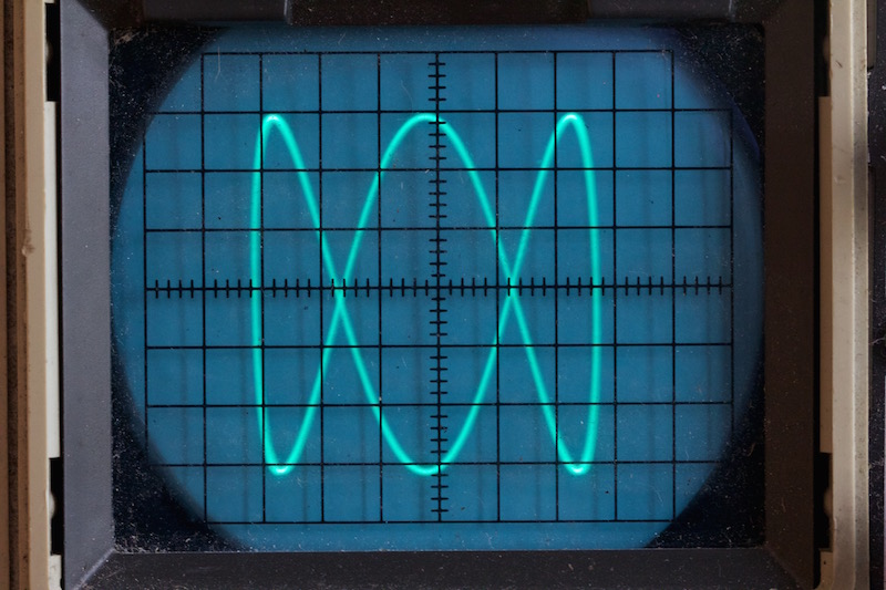
These figures are formed by long looping curves that go back and forth and left and right. In their pure form, they recall the glowing patterns seen on oscilloscopes used for special effects in a vintage scifi movies.
In this case, a useful parametric formula was one of the first things I found in researching this subject.
x = A * sin(a * t + d)
y = B * sin(b * t)
Basically what we have here is a sine wave on the x-axis, and another sine wave on the y-axis. So instead of going off infinitely in any direction, it keeps looping back in on itself.
We have a bunch of variables here. Let’s break them down.
A and B wind up being the width and height of the curve on the x- and y-axes. Or technically, half the width and height because the curve will extend that distance in each direction.
The t is a parametric variable that will range form 0 to 2 * PI. Although it can actually go beyond that in either direction, it will effectively just loop back on itself when it does. t is multiplied by a for the x component, and by b for the y component, and the sine is taken of the result on each axis. In addition, the x component has a d or delta variable added to it to move it out of phase.
This formula might look a bit familiar from the previous chapter on circles. If we set A and B equal to each other and call them r, and set a and b both equal to 1, then remove the d and use cosine instead of sine for the x component, then we get:
x = r * cos(t)
y = r * sin(t)
This is the parametric formula for a circle (with its center at 0, 0). Since cosine is the same as sine but 90 degrees out of phase, we could also say:
x = r * sin(t + d)
y = r * sin(t)
… where d equals 90 degrees, or PI / 2 radians.
You can also see the relation to the ellipse formula if you keep A and B separate, where A is what we called the “x radius” and B is the “y radius”:
x = A * sin(t + d)
y = B * sin(t)
So when everything is in sync like this, we get a circle or ellipse, but when we start changing these parameters, we get much more interesting curves.
OK, enough talk, let’s code. We can jump right into making a Lissajous function. I’ll abbreviate a bit.
function liss(cx, cy, A, B, a, b, d) {
  res = 0.01
  for (t = 0; t < 2 * PI; t += res) {
    x = cx + sin(a * t + d) * A
    y = cy + sin(b * t) * B
    lineTo(x, y)
  }
  closePath()
}
Here, the resolution value is not as straightforward as in circles and ellipses. For now, I’m just going to keep the res value very small, even if it means we’re doing to much work for simpler, smaller curves. Since we’re going from 0 to 2 * PI (6.28…), incrementing by 0.01 will give us 628 line segments, which should be enough for most cases. If it starts getting blocky, you can increase it, but I’m not going to go into how to best predict it.
Here, I did what I described above, setting A and B equal to each other, a and b to 1, and d to PI / 2. This should give us a circles, and in fact…
… it does.
Let’s set d to 0 and mess with a and b for a while. Here, a and b are 2 and 1 (again, with d at 0):
And now they are 2 and 3:
Let’s crank them up to 11 and 8.
In all these cases, with d at 0, the waves on each axis are in phase with each other. Here, I kept 11 and 8 and set d to 0.5, moving them out of phase:
Here’s an animation with a at 6, b at 7, and d varying.
It’s worth noting that a and b should be whole numbers if you want the curve to join its start and end points together smoothly. Here’s what happens if you set a to 6.4 and b to 7.3:
You can see even more clearly what is happening, if you remove the closePath call from the function:
Now you can see the curve starts and ends in random locations, rather than joining up smoothly as it does when a and b are whole numbers.
Of course, when you use fractional numbers here, you can now extend your t way past the 0 to 2 * PI range and continue to fill the space. Here, t goes from 0 to all the way up to 20 * PI:
The paths will eventually join up again if you use rational numbers for a and b. But it might take a while. Here it looks like they came pretty close.
We can of course, change A and B to get wide figures:
A = 250, B = 100
or tall figures:
A = 100, B = 250
That’s about it in terms of drawing these figures directly. Check out the Wikipedia article on the subject to learn more about the various properties of this type of curve. I was thinking about creating an interactive demo here, but it turns out there are a bunch of them on line already. A few are linked near the bottom of the Wikipedia article I just mentioned.
Instead we can look at some other applications here.
Animation
Here, I’m not talking about animating the curve itself, like I did above, but using the Lissajous curve results to animate an object. But first let’s talk about a simpler level of animation.
Oscillation
Often you want to animate an object but have it remain on screen. You just want it to go back and forth or up and down, or twist one way or the other or even grow and shrink. You might recognize that these are some of the more basic 2D transformations – translation, rotation and scaling. You can use a sine or cosine function to generate values for these transformations, and just change the input to that function over time.
We’ll have to expand our pseudocode to include a loop function that runs repeatedly forever and can draw something differently each time it’s run to create an animation. Processing has something like this built in, as may other graphics systems. But you might have to put something together yourself. If you’re using HTML and JavaScript you can use requestAnimationFrame.
And we’ll postulate into existence a clearCanvas function too. Why not? We’ll also include a circle function that can be the one we created in the last installment, or one that comes with your drawing api. We’ll start something like this:
This takes the sine of t and multiplies that by 100 to get an offset position for the circle on the x-axis. As t is continually incremented, the circle keeps going back and forth. You could easily do the same thing on the y axis, or you could apply the sine to the radius:
Here, we’re taking 50 as the base radius, and using the sine of t times 20 to that. Because sine will go from -1 to +1, we’ll be adding -20 up to +20 to the radius, making it oscillate from 30 to 70.
We could do the same thing with rotation, but then we’d have to switch to something other than a circle so we could actually perceive it rotating. I’ll leave that to you to try.
But going back to moving the circle around. Say we want to have it move all around the canvas. We could of course use sine and cosine to make it move in a circle:
But what if we wanted something more organic? We could start adding random motion, but then you run into the problem of how to constrain it so it doesn’t wander off screen. Not insurmountable, but we can do a pretty good trick using the Lissajous formula, like so:
width = 400
height = 400
t = 0
a = 13
b = 11
canvas(width, height)

function loop() {
  clearScreen()
  circle(width / 2 + sin(a * t) * 100, height / 2 + sin(b * t) * 100, 20)
  fill()
  t += 0.02
}
This is an imperfectly looping gif, but you get the idea. The circle just seems like it’s randomly moving around the screen, but it’s actually following the path of a Lissajous curve. To me it looks like a fly buzzing around. In fact, if you add several of these with different parameters, it gives you a pretty convincing swarm of flies. High numbers for a and b, that don’t have common denominators, make the most random looking path.
Lissajous Webs and Random Lissajous Webs
This isn’t anything remotely “official” that you’ll find documented anywhere (well, maybe one place I’ll mention below), but I think it’s always good to cross-pollinate different ideas. You often come up with something very unique. So I’m just throwing these out there as something I came up with.
Some years ago I had been playing about with drawing Lissajous curves and was thinking about different ways of rendering them. Rather than just rendering the paths themselves, I decided to try capturing each point that made up the curve and then connecting nearby points with lines. The results were pretty cool, and I dubbed them “Lissajous Webs”. Here’s a few examples:
I thought these were pretty damn cool looking. The technique was included in the book Generative Design (with full credit to and permission by me).
As I continued to play around with the idea, I wanted to make them even more organic. Rather than fixed a and b multipliers, I started letting these parameters wander a little bit, randomly. These wound up creating some really amazing images, which I called “Random Lissajous Webs”.
This concept became one of my more popular pieces. I was even commissioned some years later to do a series of designs using this technique that got used on wine bottles.
I’m not going to go through the code for all of these. This is more just for inspiration – how the concept of Lissajous curves led to something entirely different and very interesting.
The next chapter will look at a couple of related systems that are also very interesting ways of creating curves.
In this installment we’ll look at how to draw arcs, circles and ellipses. (And wander off on some tangents before we get done.)
It’s likely that your platform’s drawing api has at least some of this built in. For example, the HTML Canvas api does not have a circle method, but it does have an arc method as well as an ellipse method, either of which can be used to draw circles.
But it’s good to know how to do all of these manually. You’ll wind up using it someday, somewhere on some platform.
First let’s just look at arcs and circles. You can say that an arc is just part of a circle, or you could say that a circle is an arc that extends 360 degrees. So we could go at this either direction, but it makes sense to me to start with circles and specialize into arcs.
Note on Measurements
The drawing api I am using has the y-axis reversed from standard Cartesian coordinates. Negative values go up, positive down. This is very common for drawing apis which aren’t specifically made for math or science use cases. It’s the same with Processing, HTML canvas, Cairographics, .net graphics, and many others. Some apis do use Cartesian coordinates and have positive angles going counter-clockwise. Yet others, such as pygame, mix the systems – y values go down positively, but positive angles go couter-clockwise.
This affects the measurements of angles. Zero degrees is due east. In a Cartesian system, positive angles will move in a counter-clockwise direction and negative angles in a clockwise direction. In reversed y-axis systems, the opposite is true. In this chapter, I don’t make any attempt to “correct” this. The functions we’ll be creating here will mirror the built-in functions of many drawing apis.
But know that if you do want to create circle, arc and ellipse functions that operate per the Cartesian coordinates, that’s easy enough to do. And when you finish the section on arc, you’ll know how to do that.
Circles
Definition
A circle is usually defined something like “the set of points that are equidistant from a given center point”. But when you are trying to draw a specific circle, that’s not very useful. I don’t need a set of infinite points. I just need enough points to draw short line segments through that will form a circle.
You’ll also see the “equation of a circle” as x2 + y2 = r2. Also pretty useless from the perspective of trying to draw one.
But then you get to the parametric form:
x = a + r * cos(t)
y = b + r * sin(t)
Here, a, b is the center of the circle, r is the radius, and t is a parametric variable that ranges from 0 to 2 * PI.
This starts to get useful. We can define the center point and the radius and then run a for loop from 0 to 2 * PI to get a set of points that we can draw lines through.
Eternal reminder. All the code here is pseudocode. See the first post in this series for more info.
Depending on your drawing api, you might need to start off with a moveTo before the lineTos. If so, I trust you’ll figure that out. Otherwise, this is straightforward. cx, cy and radius are a, b and r from the above formula. And t is the angle we loop through.
Note the final closePath call there. That’s a feature of most drawing apis. It will draw a final line segment from where the last operation left off to the place where the current path started, closing the circle. It might be different on your platform but there should be something there.
This gives us…
One question is the 0.01 value in the for loop. At this point, this was just a rough guess. If you make it too big, like 0.2, then you’re going to be jumping around the circle in large jumps and it’s not going to look quite as good:
But if you make the increment too small, then you’re doing a lot of extra work for nothing. The larger the radius, the larger the circumference, and the more segments you need to use to make it smooth. The smaller the radius, the fewer the segments you need.
If you’re going with a constant 0.01 increment, you’re drawing 628 segments for each circle. This is way too many for a small circle.
By shear trial and error, I’ve found that a workable resolution seems to be about 4.0/radius. This looks good on circles down to a radius of 5. And on a radius of 200 draws half as many line segments as an increment of 0.01 and looks just as good. You can do some experiments on your own and see what looks good to you as it may vary by system.
A Function
With this, we can make a circle drawing function like so:
function circle(x, y, r) {
  res = 4 / r
  for (t = 0; t < PI * 2; t += res) {
    lineTo(x + cos(t) * r, y + sin(t) *r)
  }
  closePath()
}
Note that I left off the stroke in the function. This way you can create the circle with this function and then choose to stroke it, fill it or do both. If you want, you can make a strokeCircle function and a fillCircle function. Here’s how you’d use this:
Now that we have that down, we can build on this to create an arc function. Again, your api may already have this, but lets’ do it anyway.
This’ll be pretty easy. It’s the same as the circle function, but instead of starting at 0 and ending at 2 * PI, we let the user say what angles they want to start and end at.
This is all pretty straightforward, I’ll just throw the code out here without any pre-explanation:
function arc(x, y, r, start, end) {
  res = 4 / r
  for (t = start; t < end; t += res) {
    lineTo(x + cos(t) * r, y + sin(t) *r)
  }
  lineTo(x + cos(end) * r, y + sin(end) *r)
}
Told you it was simple. Instead of hard-coding the start and end angles to 0 and 2 * PI, we make them parameters. Also, I removed the call to closePath and replaced it with a final lineTo that draws a last line to the end angle, just to be precise.
But there are a couple of problems. What if I entered the start and end angles in the opposite order?
arc(width / 2, height / 2, 250, 3.5, 0.5)
This will jump out of the for loop right away because 3.5 is already greater than 0.5. Nothing gets drawn. What I probably wanted was to start at the angle of 3.5 and go around until I crossed the start of the circle and hit 0.5 again, like this:
One way to handle this is just to make sure that the end angle is greater than the start angle. We can do that by checking if it’s smaller and then adding 2 * PI to it until it is bigger.
function arc(x, y, r, start, end) {
  while (end < start) {
    end += 2 * PI
  }
  res = 4 / r
  for (t = start; t < end; t += res) {
    lineTo(x + cos(t) * r, y + sin(t) *r)
  }
  lineTo(x + cos(e) * r, y + sin(e) *r)
}
Now this should work as expected and produce the image shown above. One more thing though. We’re always making the assumption that we’re drawing the arc clockwise. We should allow the user to make that decision. Luckily this is pretty simple. We’ll just add another parameter, anticlockwise. If this is true, we just need to swap start and end and we should be good.
function arc(x, y, r, start, end, anticlockwise) {
  if (anticlockwise) {
    start, end = end, start
  }
  while (end < start) {
    end += 2 * PI
  }
  res = 4 / r
  for (t = start; t < end; t += res) {
    lineTo(x + cos(t) * r, y + sin(t) *r)
  }
  lineTo(x + cos(e) * r, y + sin(e) *r)
}
If you’re lucky, your language will let you do the swap like this:
start, end = end, start
If not, you’ll have to go the old fashioned route:
Both start at an angle of 3.5 and draw an arc to 0.5. One goes one way, the other goes the opposite way.
As mentioned at the beginning of the article, positives angles going clockwise is the default I chose here, unlike Cartesian coordinates. Now that you know how to draw arcs in either direction, you are free to make your default whichever way you want.
Now that we have a solid arc function, we can actually go back and remove some duplication from our circle function, changing it to this:
function circle(x, y, r) {
  arc(x, y, r, 0, 2 * PI, true)
}
This draws an arc from 0 to 2 * PI, which is a circle.
Segments and Sectors
There are a couple of other functions you can create if you find them useful. A segment is an arc that is joined by a line segment between its beginning and end (a chord). We can do this by drawing an arc and then just calling closePath or whatever does that on your system.
function segment(x, y, r, start, end, anticlockwise) {
  arc(x, y, r, start, end, anticlockwise)
  closePath()
}
Here’s a segment that goes from an angle of 2.5 to 4.5:
And a sector is an arc that is joined by line segments that go to the center of the circle. We can do that by executing a lineTo to the center point and then calling closePath
function sector(x, y, r, start, end, anticlockwise) {
  arc(x, y, r, start, end, anticlockwise)
  lineTo(x, y)
  closePath()
}
Here is a sector drawn with the same angles as the segment example:
Now you’re well on you way to making pie charts!
Polygons
Before we move on to ellipses, I want to give you one bonus function: regular polygons. This isn’t what I would normally think of as a curve, but mathematically, it might be. Anyway, it’s low hanging fruit, right there for the picking, so let’s do it.
When we were talking about resolution, we saw how a low resolution circle starts to look chunky. You can see the individual line segments that make it up. Well, we can push that bug even further and turn it into a feature.If we push the resolution so low that we only wind up drawing six segments in our circle (exactly six), we have a hexagon. Five create a pentagon, four a square and three a triangle. We just have to specify how many sides we want, and divide 2 * PI by that number to get the resolution that will make that shape.
Here’s one take:
function polygon(x, y, radius, sides) {
  res = PI * 2 / sides
  for (i = 0; i < PI * 2; i+= res) {
    lineTo(x + cos(i) * radius, y + sin(i) * radius)
  }
  closePath()
}
Now you can call it like:
polygon(300, 300, 250, 5)
stroke()
and get a pentagon like this:
You might want to specify an initial rotation, you can do that like so:
function polygon(x, y, radius, sides, rotation) {
  res = PI * 2 / sides
  for (i = 0; i < PI * 2; i+= res) {
    lineTo(x + cos(i + rotation) * radius, y + sin(i + rotation) * radius)
  }
  closePath()
}
Now you can say
polygon(300, 300, 250, 5, 0.5)
stroke()
and have the polygon rotated a bit.
Try it with different numbers of sides.
A fun effect is to create a series of polygons of different sizes, each slightly rotated.
angle = 0
for (r = 5; r <= 255; r += 10) {
  polygon(300, 300, r, 5, angle)
  stroke()
  angle += 0.05
}
This creates a nice pattern like so:
Might be a bit off-topic, but hey, there are five new emergent curves there! I’ll accept it.
Ellipses
Final bit of this installment, ellipses.
Well, let’s look at the definition of an ellipse, from Wikipedia…
a plane curve surrounding two focal points, such that for all points on the curve, the sum of the two distances to the focal points is a constant.
https://en.wikipedia.org/wiki/Ellipse
hmm… I get it, but doesn’t really help us to draw it. How about…
Ellipses are the closed type of conic section: a plane curve tracing the intersection of a cone with a plane
https://en.wikipedia.org/wiki/Ellipse
Nope. Let’s keep reading…
An ellipse may also be defined in terms of one focal point and a line outside the ellipse called the directrix: for all points on the ellipse, the ratio between the distance to the focus and the distance to the directrix is a constant.
https://en.wikipedia.org/wiki/Ellipse
OK, this is going nowhere. But as before, we can eventually find the parametric formula, which I’ve tweaked a bit to be similar to the one we had for the circle.
x = a + rx * cos(t)
y = b + ry * sin(t)
Here, in addition to the a and b that form the center position of the circle, we have rx and ry which I find easiest to think about as “radius x” and “radius y”, though these names will probably make mathematicians cringe. But for an un-rotated ellipse, rx will wind up being equal to half the ellipse’s width, and ry half its height.
So we can make a function:
function ellipse(x, y, rx, ry) {
  res = 4.0 / max(rx, ry)
  for (t = 0; t < 2 * PI; t += res) {
    lineTo(x + cos(t) * rx, y + sin(t) * ry)
  }
  closePath()
}
About the only thing worth mentioning here is that to get the resolution value, I divide 4.0 by the largest of the two “radii”. you might think of a better way, but this is good enough for me. Now you can call it like:
ellipse(300, 300, 250, 150)
stroke()
And get:
Bonus
Sometimes I can’t stop writing. This next part isn’t really so much about creating curves… or maybe it is. You decide. But rather than draw line segments between each point on a circle (or arc, or polygon, or ellipse), we could just draw some other shape there. We’ll have to increase the interval that we use to draw the curve so all the shapes don’t mash together. In fact, the polygon method is perfect for this. This lets us draw a circle with a set number of circles. I’m not even going to explain this code. You should get it.
width = 600
height = 600
canvas(width, height)

cx = width / 2
cy = height / 2

res = PI * 2 / 20 // to draw 20 circles
for (t = 0; t < PI * 2; t += res) {
  x = cx + cos(t) * 200
  y = cy + sin(t) * 200
  circle(x, y, 20)
  stroke()
}
Which gives us:
Summary
I’m already elaborating on this in my head, but we’re off-topic enough, and this installment is long enough.
So far things have been pretty basic, but hopefully still interesting. From here on, they will get a bit more complex and hopefully even more interesting.
This is going to be a relatively simple one, but we’ll get into a few different applications. I’m not going to take a deep dive into what trigonometry is, there will be no images of triangles with the little square in the corner telling you which angle is 90°. No definitions of adjacent, opposite, hypotenuse. And NO soh-cah-toa!!!
I’m going to assume you know all that stuff. And if you don’t, a google search for basics of trigonometry will net you about 18,800,000 results in under one second. Proof:
So if you have no idea what I’m talking about in that first paragraph, stop here and do some learning on that stuff first.
Wait, what am I doing? Totally ignoring an opportunity for shameless self-promotion on my own blog. OK, here’s a playlist of trigonometry videos by myself. The best material on the subject out of all of those 18 million results, or your money back.
OK, there are a few basic trig functions that your language should have somewhere in it. Maybe they are global, maybe part of a math library. For this post, we’ll be dealing with what you’ll probably find named sin, cos, and tan. These stand for sine, cosine and tangent, which you should know about or have just learned more about above.
Let’s start with sin. You pass it a number and it gives you a number back. If you give it 0.0, it returns 0.0. As you increase that argument incrementally, the result you get will slowly increase up to 1.0 – or almost 1.0 anyway. Then as you continue to increase it it will go back down to 0.0, then down to -1.0 and back up to 0.0. As you continue to increase the argument, the result will continue to oscillate between -1.0 and 1.0.
Try it out:
for (i = 0.0; i < 6.28; i += 0.1) {
  print(sin(i))
}
In your language, you might need println or some kind of console or log function to display values. But you should get some output that looks like:
As I predicted, it starts at 0, goes up to 0.99957… and then starts going down again. Your output should continue going down to something like -0.999923… and then back up to almost 0.0.
Note that it did exactly one cycle of 0 to 1 to -1 to 0. Not a coincidence. It’s because the for loop ends at 6.28, which is approximately 2 * PI. Or 2 * 3.14… In most programming languages, the trig functions work on radians rather than degrees. This is another point I’ll assume you have some understanding of. But a radian is approximately 57 degrees. And 3.14… (PI) radians is 180 degrees. 6.28… (2*PI) radians is 360 degrees.
So the result of sin will go from 0 to 1 to -1 to 0 exactly one time from 0 to 360 degrees, or 0 to 6.28… radians.
If you change the for loop to end at PI (most languages have that as a constant somewhere) and the numbers should go from 0.0 up to 1.0, back to 0.0 and stop there. That’s half a cycle.
Bring on the Curves!
OK, let’s draw a sine wave. Size your drawing area to 800×500. It’ll also be helpful to set variables (or constants) to the width and height values. Then have a for loop with a variable x going from 0 to 800, using that width variable. Then we’ll take the sine of x and that will be our y value. We’ll add that to half the height so our sine wave will run along the center of the image. Draw a line segment to x, y and we’re all set.
Remember, this is all psuedocode. You’ll have to convert this to the language and drawing api of your choice. More details in the series intro.
width = 800
height = 500
canvas(width, height)

for (x = 0; x < width; x++) {
  y = height / 2 + sin(x)
  lineTo(x, y)
}
stroke()
Depending on your drawing api, you might have to start with a moveTo(0, height/2) before you do the lineTos. When you’re done, you should have something like this image:
That’s a sine wave, but maybe not quite what you would expect. There are two problems, which is good, because they both lead into the next two things we need to talk about: wavelength/frequency and amplitude. Here, there are too many waves – the wavelength is too short (or the frequency is too high), and the waves themselves are mere blips – the amplitude is too low.
Amplitude
The amplitude is easy enough to handle. The sin function returns from -1.0 to 1.0, so we just need to multiply that number by an amplitude value and we’ll be good. The height times something like 0.45 will make the wave just smaller than the size of the canvas.
That gives us height, but there are still too many waves so it’s hard to even comprehend this as a sine wave. We’ll fix that next.
Wavelength and Frequency
Wavelength is… wait for it… the length of a wave. Or the length between the same point on two consecutive waves. In the real world, these are actually physical distance measurements, with units anywhere from meters to nanometers, depending on what kind of wave it is you are measuring.
Another way of measuring waves is frequency – how many waves there are in a given interval (of space or time).
Wavelength and frequency are inversely related. A low wavelength (small distance between waves) equals a high frequency (many more waves in a given space). A high wavelength equals a low frequency.
You can write code to use either method of measurement. Let’s start with frequency.
Frequency
This is often specified as “cycles per second” (cps) rather than cycles in a given distance. Radio waves, for example, hit a receiver of some kind and we can just count how many hit it each second. The term “Hertz”, abbreviated “Hz” is the same as cycles per second. 100 Hz is 100 cycles per second. One kilohertz is 1000 cps, one megahertz is a million cps, etc.
Since we’re not dealing with moving waves though, it’ll be easier for us to measure frequency in terms of how many cycles occur in a given space. What you come up with here is up to your given application, but since we’re currently drawing a sine wave across an 800-pixel wide canvas, we can say that a frequency of one means that we should see one cycle occur as the wave goes across that canvas.
There’s a bit of math involved, so I’ll throw the pseudocode out there, then we’ll go through it.
First we create a new variable, freq and set it to 1.0.
Then instead of just taking the sine of x, we divide x by width. This results in values from 0.0 to 1.0 as we move across the canvas.
Then we’ll multiply that by PI * 2. This will give us values from 0.0 to 6.28…, which should be familiar from the very first code example. This alone would make the results go from 0 to 1 to -1 and back to 0 exactly one time, as we saw. One cycle.
Finally, we multiply that by freq. That’s set to 1.0 now, so we’ll still get one cycle. With all this in place, you should be seeing this:
OK, that’s more like it. But you might be more used to the sine wave going up first, then down. If you’re seeing it go down and then up, like in my example, it’s because your drawing surface has the y-axis oriented such that positive values go down, the reverse of Cartesian coordinates. If you know how to use the 2d transform methods of your drawing api, you can fix it that way. I’ll go for a simpler fix of just subtracting y from height in the lineTo call.
Now you can mess with those two variables, amplitude and freq to create different waves. Here I set amplitude to 50 and freq to 5:
Wavelength
Now let’s encode this to use wavelength instead of frequency. In this case we’ll be defining wavelength in terms of how many pixels it will take the wave to complete a full cycle. Let’s say we want one cycle to be 100 pixels long. Again, here’s the code, explanation to follow:
This time, inside the sin function call we divide x by wavelength. So for the first 100 pixels, we’ll get 0.0 to 1.0, then for the next 100 pixels 1.0 to 2.0, etc.
This gets multiplied by PI * 2, so for every 100 pixels we’ll get some multiple of 6.28… and will execute a complete wave cycle.
The result:
Since our canvas is 800px and the wavelength is 100px, we get eight full cycles, as expected.
Resolution
A quick word about resolution. Here, we are moving through the canvas in intervals of a single pixel per iteration, so our sine waves look pretty smooth. But it might be too much. If you are doing a lot of this and you want to limit the lines drawn, you can do so, with the possible loss of some resolution. We’ll just create a res variable and add that to x in the for loop and see what that does. We’ll start with a resolution of 10.
width = 800
height = 500
amplitude = height * 0.45
freq = 3
res = 10
canvas(width, height)

for (x = 0; x < width; x += res) {
  y = height / 2 + sin(x / width * PI * 2 * freq) * amplitude
  lineTo(x, height - y)
}
stroke()
On the plus side, we are drawing only 10% of the lines we were drawing before. But you can already see that things have gotten a bit chunky. Going up to 20 for res reduces the lines drawn by half again. But now things are looking rough.
But the important thing is knowing the options, their benefits and tradeoffs.
Cosine
I’m going to keep this one really quick. Because everything I’ve said about sine holds true for cosine, except that the whole cycle is shifted over a bit. Going back to a single cycle and simply swapping out cos for sin …
Here, an input of 0.0 gives us 1.0. And then we drop to 0.0, -1.0, back through 0.0 and end on 1.0 as we move from inputs of 0.0 to 2 * PI. It’s the same wave shifted over 90 degrees (or PI / 2 radians). It’s easier to see if we move the frequency up a bit.
I don’t really have a whole lot to say about cosine waves for this post. But we’ll be revisiting them again later in the series.
A Function
We can use everything we’ve covered so far to make a reusable function that draws a sine wave between two points. Again, I’ll do the pseudocode drop and then the explanation.
function sinewave(x0, y0, x1, y1, freq, amp) {
	dx = x1 - x0
	dy = y1 - y0
	dist = sqrt(dx*dx + dy*dy)
	angle = atan2(dy, dx)
	push()
	translate(x0, y0)
	rotate(angle)
	for (x = 0.0; x < dist; x++) {
		y = sin(x / dist * freq * PI * 2) * amp
		lineTo(x, -y)
	}
	stroke()
	pop()
}
This function has six parameters, the x and y coords of the start and end points, frequency and amplitude.
We get the distance between the two points on each axis as dx and dy.
Then, using these, we calculate the distance between the two points using the Pythagorean theorem and the sqrt function which should be somewhere in your language.
And we get the angle between the two points using the atan2 function that should also be available. If you don’t understand what’s happening so far, I suggest you go look at the references at the beginning of the post.
Now this function is assuming that your drawing api has some 2d transformation methods. If so, it probably also has a way to push and pop transforms from a stack. In HTML’s Canvas api for example, these would be context.save() and context.restore().
We want to push the current transform to the stack so we can transform the canvas, do our drawing, and then restore the earlier state when we are done. So we call push.
Then we translate to the first point and rotate to the angle we just calculated. At this point we just need to draw a sine wave using dist, freq and amp exactly as we’ve been doing.
Since our canvas is translated exactly as we want it, we can just call lineTo(x, -y) which just corrects the sine wave like we did before.
When we’re done, we stroke that path and call pop (or restore or whatever your api uses) to leave things how we found them.
This draws a sine wave starting at 100, 100, going to 700, 400, with a frequency of 10 and amplitude of 40.
If your drawing api does not have transform methods, I pity you. You can still do this kind of thing, but it will be much more complex. And beyond the scope of this post.
As mentioned in the comments below, the “frequency” aspect of this method might be a bit confusing, because the way it’s coded “frequency” means “number of cycles between point A and B”. So a long wave drawn with this method would have a larger wavelength than another, shorter line drawn with the same frequency. To address this, you might want to change the function to use wavelength instead. This would ensure that all waves drawn with the same wavelength would look similar, no matter how long they were. Another option would be to adopt a frame of reference for frequency, like “so many cycles per 1000 pixels” or something. What you do here depends on your needs and application, so I’ll leave that up to you.
Tangent
Drawing tangent curves is not nearly as useful as sine and cosine waves, but we’ll cover it for completeness.
Unlike the two functions we’ve covered so far, tangent does not constrain itself to the range of -1 to 1. In fact, it’s range is infinite. Let’s do the same thing we did for sin and just trace out the values.
for (i = 0.0; i < 6.28; i += 0.1) {
  print(tan(i))
}
You’ll get something like this:
Again we start at 0, but quickly go up to 14, then jump to -34. But that’s deceiving. The values are truncated because we are moving in relatively large steps of 0.1. What is actually happening is that we are rapidly going up to positive infinity as the input angle approaches PI / 2 radians (or 90 degrees). Once it crosses that value, it jumps towards negative infinity, swiftly rises to 0.0 again at PI radians (180 degrees) and then repeats the cycle again once more before it gets to 2 * PI radians (360 degrees). This isn’t a linear progression though – it executes a curve as it approaches and leaves 0. Let’s code it up using frequency to see a single tangent wave cycle.
Same thing here again, but swapped out tan for sin. I also reduced the amplitude just so we could see the curve better. In fact, it’s probably a misnomer to talk about the amplitude of a tangent wave since its amplitude is actually infinite. But this value does affect the shape of the curve.
One thing to note is those near-vertical lines that shoot down from positive to negative infinity. Those aren’t technically part of the plot of the tangent. Mathematically, it implies that the tangent could have a value somewhere along that line at some point, but it will not. It is actually undefined at an angle of 90 and 270 degrees. And near infinity/negative infinity just before and after those values.
Not sure if this one will be of much use to you, but there it is.
Summary
Well, we got through the first few curves in this series. Good ones to have under the belt as a lot of other curves will uses these functions in one way or another. See you soon!
For a number of years, I’ve been wanting to writing a book called “Coding Curves”. There are all kinds of really fascinating curves that are fun to code and understand and create very interesting images. I’ve started this book at least three times. I’m feeling the urge to to it again, but I’m going to be more realistic about it this time. I don’t think I’m going to sit down and write a book cover to cover and get it formatted and edited and self publish it. I’ve accepted that that’s just not going to happen. But I want to write about this stuff.
The Plan
So I’m going to do it as a series of blog posts. I don’t know how often these posts will come out. Maybe once a week if I’m diligent. Maybe more often if I get on a roll. Maybe less if I get bored, distracted, or busy with other things. But even if there’s a gap, I can pick back up where I left off and continue.
Maybe, when it’s all done (will it ever be?) there will be enough there to actually compile into a book. Who knows.
Update (2/19/23)
It’s “done”. Which is not to say that I’ll never add to it, but I’ve covered what I set out to cover initially, and I’m pretty happy with it. I may eventually compile it all into an ebook that people can download as a single file and read like that. Probably under a pay-what-you-want type system. But for now, other projects await.
Table of Contents
This is the plan. It may differ, but we gotta start somewhere. I’ll link the posts as they come out here, so this post can continue to serve as an index.
In general we’ll be covering two-dimensional curves. Some of these subjects will take multiple posts to cover. I’ll update the TOC as it evolves. There may be more subjects too, and I’m open to suggestions.
The Audience and Purpose
The audience for this course is people who are interested in exploring different types of curves and want practical techniques for drawing them. It may be artists, designers, game developers, UI developers, or recreational mathematicians. This is NOT a mathematics course, though there will be plenty of math in it. A lot of the explanations I give will be very incomplete. There will hopefully be enough information in the materials to give you the understanding you need to draw the given curves and expand on them. But at best, each chapter will be a mere introduction to a topic. Hopefully nothing will be straight out incorrect, but I’m happy to hear about it if there is, and will make my best efforts to correct it.
Personally, I love finding some new mathematical formula that I can apply to create some new, interesting shape, then tweaking the parameters to see how it changes that shape, and eventually animating those parameters. And finally combining the formula for one curve with the formula for another one and possibly making some shape that nobody has every seen before. If any of that rings true for you too, you will probably enjoy reading through this.
The Format
Most of what I’ve written before has been tailored to a specific language. For example, I wrote Playing With Chaos using JavaScript and HTML 5 Canvas. The idea was that it should be generic enough to convert to any language or platform, but I felt I needed to base it in some concrete language.
After recently reading a couple of really fantastic books on ray tracing (covered here), which were completely language agnostic and only included pseudocode samples, I’ve changed my thinking about this. So all “code samples” in this series will actually be “pseudocode samples”.
So write in whatever language or platform you want. The main requirements will be:
A. The ability to set up and size a canvas or drawing surface of some kind.
B. The ability to draw lines of different colors and widths on said canvas.
C. Typical language features and control structures like functions, variables, for loops, conditionals, etc. We’ll probably need some kind of array or list as well as some structured object type, so we can have a point object that has x and y properties. Most of this is all table stakes for any modern language, though it may look different in each one.
Additionally, it will be nice if you can draw circles (or at least arcs, which can become circles) and rectangles, and be able to fill an area with a given color. Extra credit if your drawing api lets you write text to the canvas.
I’ll avoid going as deep as OOP or FP as those can look quite different on different platforms, but we’ll need some functions, so I’ll keep those pretty basic:
canvas(500, 100)
foo(100)

function foo(count) {
  for (i = 0; i < count; i++) {
    moveTo(i * 10, 10)
    lineTo(i * 10, 90)
  }
  stroke()
}
Resulting in:
A few things to note here.
First, I’m calling the function before it’s defined. That might work in your language, or it might not. If not, you’ll have to rearrange things.
Secondly, the drawing api functions are written like global functions. It’s likely that in your drawing api, these will need to be called as methods of some kind of canvas object, which may have to be passed into the function, or might be able to be defined globally. I’m going to ignore that and assume that you can figure stuff like that out. The focus here is on covering concepts, not best coding practices.
Also, I’m not bothering with types for vars, args or returns, unless in some instance it becomes non-obvious and important.
As I get deeper into the series, my pseudocode style might change somewhat. If so, I’ll come back here and update things.
Yesterday I created a little Go library to manage ANSI escape codes in Go.
I’ve been working on a command line app that will have a user selecting items from a list and asking a few questions in order to configure how the app runs. I realized that a bit of color would add a ton of context and make the experience much easier to navigate.
It turns out that there are quite a few libraries that do this kind of thing. Initially I used https://github.com/fatih/color which is pretty nice. But as always there were one or two things that didn’t work exactly the way I wanted them to. I started looking into how colors are defined in shells and just kind of wound up going down a rabbit hole on the subject.
I started just making a few functions that did the few things I wanted to do. These actually were sufficient to replace all of what I was doing with the library. But I kept working on it and kept seeing ways to improve it. And I was learning a lot and having fun. I started in the morning and banged on it off and on all day
Basics
ANSI escape codes can do all kinds of things in the terminal. You’re already familiar with a few, like \n for a new line, and \t for a tab character, and maybe \r for a carriage return (moves to the beginning of the current line without adding a new line).
Most people take a deep dive into escape codes when, like me, they want to set colors in the terminal. I’ve messed with this before when setting up my custom prompt a few times. But “promptly” forget about how it works each time. (Come on, that was good!)
But they are also useful for setting properties like bold, underline, reversed, moving to different locations in the terminal, clearing existing text from a line or the whole screen.
Most of these settings start by printing the escape code character to the terminal. That escape code is 27 in decimal, but you need to format it as an escape character. This can be done in a few different ways.
The most common way is octal:
\033
But some people prefer hex:
\x1b
If you’re really into unicode, you can even go with:
\u001b
I prefer \033 so that’s what I’ve used throughout.
After the escape code, you need to print an opening square bracket for most of the commands we’ll be using. This is the Control Sequence Introducer or CSI.
\033[
Now you’re set up to enter a code that actually does something.
Colors
Basic colors are defined by a number between 30 and 37, followed by the letter “m”.
Some references will tell you that you need two numbers, separated by a semicolon, and followed by the letter “m”. The first number can be 0 or 1 and specifies the brightness/boldness of the color. The second number is a number from 30 to 37 inclusive. This gives you eight base colors with two shades for a total of 16.
This is actually pretty inaccurate and I’ll cover the truth below, but for now let’s just look at the eight base colors.
To set a regular red color, you’d do this:
\033[31m
Try it in a terminal like so:
echo "\033[31mHello, world, I am red."
If this doesn’t work for you, you might have to pass -e to the echo command to enable it to interpret the backslash escape character.
echo -e "\033[31mHello, world, I am red."
These colors may look slightly different depending on your OS, terminal emulator and colorscheme in use.
Here are the color codes;
30: Black
31: Red
32: Green
33: Yellow
34: Blue
35: Magenta
36: Cyan
37: White
The Shocking Truth about that Leading 0/1
First, let’s learn about another ANSI code – bold. The code for bold is just 1. And if you want to turn it off, or explicitly say not bold, use 22.
echo "\033[1mThis is bold!"
You can even insert the sequence in the middle of a string and turn it off again later.
echo "The word \033[1mbold\033[22m is in bold"
It’s subtle there, but yeah.
We can combine multiple sequences into one. Just set the color code, a semicolon, and the bold code, all followed by the “m”. For example, we can add a color and the bold attribute. Let’s compare “regular yellow” with “yellow plus bold”.
So as I said, some references tell you you need the 0 or 1, followed by the color code to fully define a color. Like this:
Black        0;30     Dark Gray     1;30
Red          0;31     Light Red     1;31
Green        0;32     Light Green   1;32
Brown/Orange 0;33     Yellow        1;33
Blue         0;34     Light Blue    1;34
Purple       0;35     Light Purple  1;35
Cyan         0;36     Light Cyan    1;36
Light Gray   0;37     White         1;37
This is wrong and misleading. There are eight basic colors and 1 is the code to print in bold. Period. Yes, unbolded yellow can be pretty dim and look more orange or brown, but these are non-standard, random names that just confuse things.
So what about 0? Well it’s not the “not bold” code. In fact, we already saw that 22 is the code to undo bold.
In fact, 0 is the reset code. It resets all styles. So it’s actually pretty good to have it in there as a first code, especially when you are trying to create a new style when other styles might already be in play.
But thinking that the first code should be “0 or 1” is very misleading and can lead to confusion. Here’s a use case:
Say I wanted some text in regular green, underlined and then the more text in bold red – not underlined. If I’m fixated on “0 or 1”, then I’ll do something like this (4 is the code for underline):
echo "\033[0;32;4munderlined regular green \033[1;31mbold red"
But now the red is still underlined. If I change the last 1 to a 0, then I’ll get rid of the underline, but I’ll lose the bold. I actually need both! And there’s no problem with doing that.
echo "\033[0;32;4munderlined regular green \033[0;1;31mbold red"
In fact, you could move the 1 later, like this:
echo "\033[0;32;4munderlined regular green \033[0;31;1mbold red"
The first version is saying “clear it, then make it bold and red” and the second one is saying “clear it, then make it red and bold”. Same thing.
Thinking that colors are a two-part code with a leading 0 or 1 is just incorrect. Saying you have to prefix a 0 or 1 is literally saying, “reset all styles OR add a bold style to whatever style is there already.” Illogical.
It took me a long time to work through the logic of all this, but now it makes a lot more sense. Hopefully this helps you down the line.
Actual Bright Colors
There’s one more color / shading alternative, which is another set of actual “bright” colors from 90 to 97. These are brighter than the regular colors, but don’t give you quite the brightness as the bold versions.
Below you can see 36m, 96m, 1;36m and 1;96m.
A subtle difference, but good to know. (Actually I don’t see any difference in the last two, but maybe you do.)
Background Colors
You can also use ANSI escapes to set background colors. these again follow the same sequence but go from 40 to 47.
echo "\033[41mRed background"
Now you can combine a background and foreground color:
echo "\033[0;1;32;41mGreen on red, my favorite"
There are other codes for making text more dim, or italic or strikethrough, but these have much less support in terminal emulators than the ones I’ve mentioned.
And if you have a supported terminal, you can specify up to 256 colors with a bit different syntax that I’m not going to cover here because it’s just beyond what I need.
There’s a whole lot of other stuff you can do with these codes, including moving the cursor up or down or left or right or to a specific row and column, and clearing part or all of a line or part or all of the terminal window.
This page is one of the better one-stop references I’ve found:
And this will print in bold red on a black background. One of the cool things about using these sequences in code is that they are “sticky”, i.e. once you set some of these properties, they apply to anything else you print to the console until you change or reset them. This is unlike using echo in the terminal itself, where each escape is one-shot.
In addition to these sticky property settings, I also created a few print helper functions that mirror the built in Go print functions: ansi.Print, ansi.Printf, and ansi.Println. These just add an ANSI color constant as a first argument.
ansi.Println(ansi.Red, "this will be red)"
Like echo, these are one-shot functions, which is useful when you want to print one message in a color and not have to worry about resetting things back to default.
It also has functions for several of those cursor movement and screen clearing codes.
As I said there are plenty of other libs out there that do similar things, but I built this to work just the way I want it to. So I’m keeping it!
Anyone who follows me on twitter has seen what I’ve been up to in the last month and a half or so. But to hop on a meme from last year…
How it started:
September 18, 2022
How it’s going:
October 23, 2022
Not bad for 35 days of nights and weekends, if I do say so myself, but let’s go back to the start and take an image-filled journey.
It started in a book store
My wife, daughter and I are all book addicts. Our idea of someplace fun to go on the weekend is Barnes and Noble, which is about a ten minute drive down the highway. We were there one Saturday and I saw this book and started looking through it:
The first half of the book is about ray tracing and the second half is about rasterized 3D. The content looked really accessible and even just skimming through it, it seemed like something I could follow along with and code. I recently got an oreilly.com subscription, so I was able to access the book there, and had the first image you see above rendered in no time. And I understood what was going on with the code. I was hooked!
What is Raytracing?
I’m absolutely not going to try to teach you raytracing, but I’ll try to give you a 10,000 foot view.
The two major schools in 3D rendering are ray tracing and rasterization. Rasterization usually involved creating a bunch of triangles or other polygons out of a bunch of 3D points, figuring out how to fill in those triangles and filling them in. I’ve coded that kind of thing from scratch multiple times at different levels of thoroughness over the last 20 years.
Raytracing though, is something I’ve never touched. It involves making a model of 3D primitives and materials and lights, and then shooting out a ray through every pixel in the image, seeing what that ray hits, if anything, and coloring it accordingly.
A good analogy from the book is if you held a screen out in front of you and looked through each hole in the screen from a fixed viewpoint. Left to right, top to bottom. When you looked through that one hole, what did you see? Color a corresponding point on a canvas with that color paint. You might see nothing but sky in the top row of the screen, so you’d be doing a lot of blue points on the canvas. Eventually you’d hit some clouds or trees and do some white or green dots. Down lower you might hit other objects – buildings, a road, grass, etc. When you worked through all the holes in the screen, you’d have a completed painting. If you understood that, you understand the first level of raytracing.
So you model three spheres and say they are red, green and blue. You shoot a ray from a fixed “camera” point, through each pixel position in your image. Does it hit one of the spheres? If so, color that pixel with the color of the sphere it hit. If not, color it black. That’s exactly what you have here:
A ray is a mathematical construct consisting of a 3D point (x, y, z) and a direction – a 3D vector (also x, y, z). So the first step is to get or create a library of functions for manipulating 3D points and vectors and eventually matrices. There’s a fairly simple formula for finding out if a ray intersected a sphere. It will return 0, 1 or 2 points of intersection. Zero means it missed entirely, one means it just skimmed the surface, and two means it hit the sphere, entered, and exited.
Of course a single ray may hit multiple objects. So the algorithm has to find the first one it hit – the intersection closest to the origin of the ray. But… it’s entirely possible there could be objects behind the camera, so you need to filter those out.
Lighting, shadows, reflection
The first image looks a bit flat, but lighting, shadows and reflection take care of that. Add to your world model one or more lights. There are different types of lights, but point lights have a point and an intensity. The intensity can be a single number, or it could be an RGB value.
When you find your point of intersection for a given pixel, you then need to shoot another ray from that intersection point to each light. Can the ray reach the light without being blocked by another object? If so, what is the angle at which the light is hitting the object at that point. If it’s hitting straight on, that part of the object will be brighter. If it’s hitting at nearly 90 degrees, it’s just barely lighting it.
And that’s just for diffuse material. But that gives you this:
You can tell that my light in this picture is off to the right and a bit higher than the spheres. You’ll also notice that there seems to be a floor here, even though I’ve only mentioned spheres. The trick to that is that the yellow floor i just a very large sphere. But it also illustrates that closest intersection point. For some pixels the ray hits the yellow floor sphere first, so you don’t see the red sphere, but in other areas, it hits the red sphere first, so it blocks out the yellow one.
In order to figure out that light/angle part, you need to know the “normal” of the surface. That’s another ray that shoots out perpendicular to the surface at that point. I knew from previous dabbles in 3D graphics that if you start messing with that normal, it changes how light reacts with the surface. So I took a bit of a diversion and used a Simplex noise algorithm to alter the normal at each point of intersection. I just hacked this together on my own, but I was pretty much on the right track.
But getting back on track, some materials are more shiny and the light that reflects off of them depends on the angle you are looking at them from. So there’s another calculation that takes into account the surface normal, the angle to the light, and the angle to the camera or eye. This gives you specular lighting.
Getting better. But then there are shadows. When you are shooting that ray out from the intersection point to each light, you have to see if it intersects any other object. If so, that light does not affect the color of that pixel.
Here, there are multiple lights, so you see shadows going off in different directions. Already things are starting to look pretty cool.
Finally, reflections. When a ray hits an object, and that object is reflective, it’s going to bounce off and hit some other object, which is going to affect the final colorization of that pixel. It can be confusing because this is all being calculated in reverse of the way light works in the real world. We’re going from the destination and working back to the source.
If you have multiple reflective objects, the light might wind up reflecting back and forth between them for quite a while. This is not only very costly, but it has quickly diminishing returns, so you usually set a limit on how many levels of reflection you want. So now you are figuring out the color of a given pixel by factoring in the surface color, each light and its angle, what kind of material you have, and all possible reflections. Sounds intimidating, but when you figure out each piece one by one, they all fit together way too logically and just work to create something like this:
And that is about as far as I got with the first book. Spheres, lights, shadows, materials, reflections. I could change the size of the spheres and move them around, but couldn’t deform them in any way. Still, with all that, I was able to have a jolly good bit of fun.
Phase 2 – The Next Book
Getting this far took me just about a week. Could have been faster, but every time I coded a new feature I’d spend an hour or several playing with it. I was excited but I needed more than simple spheres. I wanted to mess with those spheres, squish them and stretch them and apply images and patterns and textures to them. I wanted a real floor and cubes and cylinders and cones and whatever else I could get.
The Computer Graphics from Scratch book was great and I highly recommend it if you want a quick jump into the subject. One thing I particularly loved about it is that it wasn’t the kind of book that just dumps a lot of code on you and explains it. It gives you the concepts, the formulas and maybe some pseudocode and it’s up to you to choose a language and figure out the implementation details. I wound up doing mine in Go because its the language I am currently most comfortable with. But I think the author does have some sample code somewhere that is done in JavaScript.
But I was ready for the next part of the journey. So I found my next book:
Oh yes, this is the one! This one goes deep and long and it took me almost four weeks to get through, but I could not put it down. Again, I’d learn something new in the first hour or so of an evening, and spend the rest of the evening messing around with it and rendering all kinds of new things using that concept.
This is honestly probably one of the best written technical books I have ever read. Like the first one, it gives you no source code and is not tied to any language. Again the author provides concepts, algorithms and some pseudocode where needed. But as the cover says, it’s a test driven approach. I cringed at first, but I was so happy for this approach as I got deep into it. For each new concept the author describes what you need to do and then gives you a test spec. Like, “given this set of object with this set of inputs, calling this method should give you these values…” Very often it is as specific as, “the color value should be red: 0.73849, green: 0.29343, blue: 0.53383”. I just made those numbers up, but yeah, it’s like down to 5 digits. I was skeptical when I first saw this. Like no way can you let me choose the language and platform and implementation details and expect that I’m going to be accurate down to 5 digits across three color channels. But goddamn! It was in almost every case. I only saw some slight diversion when I got down into transparency and refraction. And then I was still good down to 4 digits. Any time I was off by more than that, I eventually found a bug in my own code, which, when fixed, brought it back to the expected values. Amazing! These tests caught SOOOOOO many minor bugs that I would have been blissfully ignorant of otherwise. It really sold me on the value of testing graphical code, something I never really considered was possible. Brilliant approach to teaching!
The first few chapters were slow. It was building up that whole library of points and vectors rays and matrices and transformation functions. And then finally the camera and world and spheres and intersections. It wasn’t until Chapter 5 that I could render my first sphere! And I was back to this:
But we move pretty quickly from there to lighting things up:
And then right away into transforming those spheres!
And then into shadows and finally beyond spheres into a real plane object!
Then we got to an exciting part for me: patterns. Algorithmic ways of varying a surfaces. The author explained a few – stripes. checkers and a gradient, but I went off on a wild pattern tangent of my own.
Eventually I got back on track and got back through reflection and then on to transparency with refraction!
The refraction part was the hardest so far. The code itself got pretty involved but beyond that it’s really hard to compose a compelling scene with transparent, refractive objects. It’s way too easy to overdo it and it winds up looking unrealistic. Best used with a light touch.
I took another short diversion into trying to model some simple characters. This one cracked me up.
It wasn’t intended, but it wound up being a dead ringer for this classic:
Finally we got onto new object types. Cubes, cylinders, cones:
And I took some diversions into combining these in interesting ways.
Then we created triangles. And built shapes up from them.
There was a good chunk of that chapter devoted to loading, parsing and rendering object files and smoothing triangles out, etc. This was the one of the few parts of the book I jumped over because I’m not really interested in loading in pre-built models. The other part I jumped over was bounding boxes. This is mostly an optimization technique to limit the number of objects you have to test for collisions. I’ll have to get back to that eventually.
But the next exciting topic was groups and CSG groups – constructive solid geometry. This is where you take two shapes and combine them. The combination can be a union – you get the outline of both shapes, an intersection – you just get the parts of both shapes that overlap, or a difference – the second shape takes a bit out of the first. Although you can only combine two shapes at a time, a CSG group is a shape itself, which can be combined with other shapes, winding up with a binary tree kind of structure that can create some very complex forms.
This is a sphere with another sphere taking a bite out of it, and then punched through with a cylinder. I didn’t spend nearly enough time with this, but will surely do so.
That wrapped up the book, but I continued to explore. I was still intrigued with patterns. A pattern is essentially a function that takes an x, y, z point and returns a color. Hmm… what could we do with that? I know! Fractals!
These are not fractal images mapped onto surfaces. The Mandelbrots and Julias are computed at render time. Very fun.
From there, I started working out image mapping on my own.
I did pretty damn well working image mapping out by myself. *Pats self on back* But it wasn’t perfect. There were some concepts I was missing and things got funky now and then. These images are the ones that worked out well. You won’t see all the ones that were just a mess.
I also started exploring normal perturbation more, with noise and images – normal maps and bump maps.
Again, these look good, but I was missing some concepts.
As I did more research, I eventually discovered that the author of The Ray Tracer Challenge had published a few bonus chapters on his site.
One of these was about texture mapping. This gave me the final pieces that I was missing in image and bump mapping. And I was able to do stuff like this.
Part of that chapter was about cube mapping which was super complex and contained the only actual errors I found in the author’s work. I confirmed it on the books forum site with a few other people who ran into the same issue.
Once you have cube mapping, you can make what’s called a sky box. You make a huge cube and map images to its side. The images are specially warped so that no matter how you view them, you don’t actually see the cube. It just looks like a 3D environment. That’s the image you see at the top of this post.
Here you can see the render minus the skybox:
And here is the skybox by itself:
Though it looks like it could just be a flat background image. I could actually pan around that image and view it from any angle. Note the reflections in the full image, where you can see buildings that are behind the camera reflected in the sphere.
And there you can see some live, interactive demos of those skyboxes where you can pan around the image in real time.
The final thing I’ve been working on recently is creating a description format for a full scene. I tried JSON and TOML, but settled on YAML as the best one to handcode a descriptor scene. Now I have an executable file that I just point to a YAML file and it creates the scene, renders it and outputs the image.
Here’s another image using that same skybox with some other objects:
This was rendered completely with this new executable. I only wrote this YAML to describe it:
One other thing I worked on was antialiasing. The way this is done is instead of just getting the color of a pixel with a single ray, you take multiple samples around fractional parts of that pixel. Some references say up to 100 samples per pixel and then average them. I’ve found that’s way too many. Actually 16 looks pretty good – it makes a HUGE difference in quality. I can’t see any difference in quality if I go past 64 samples though. But it might be different for high res images.
The Future
After 5 solid weeks of working on this in my every spare moment, I needed to step back a bit and breathe. Which for me, meant creating a vim plugin. 🙂 But I’ll be back to this before long. There is still a lot to explore in this realm.