Here’s a tutorial on a really neat and powerful math art technique that I first came across years ago in the book, Computers, Pattern, Chaos and Beauty by Clifford Pickover. It’s described in Chapter 14, entitled Dynamical Systems. More recently I’ve seen it described as “Popcorn”. I’m not sure where that name came from, but there’s a good chance it originated with Paul Bourke, who used the term back in 1991 in this article.
The technique is based on some very simple formulas – just using a couple of trig functions (sine and tangent in this example) to transform an x, y point repeatedly. But it creates some amazingly intricate, complex and beautiful images. It’s also open to a nearly infinite amount of hacking by changing the few constants used or swapping out which trig functions you use or how you compose them.
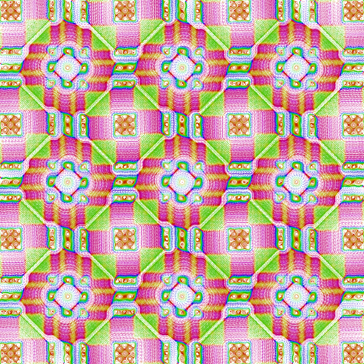
I first experimented with this technique back in 2009, coming up with images like this:
And I revisited it in 2016
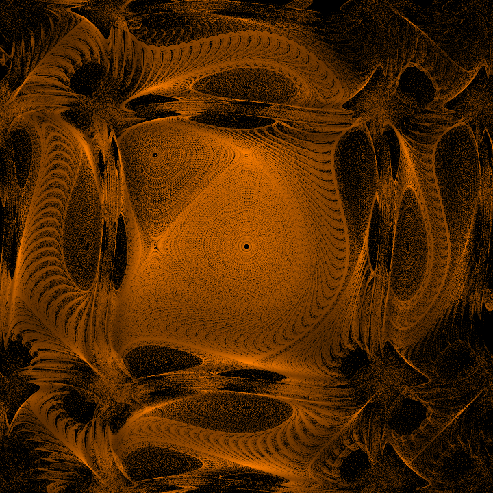
More recently I created some more still images and animations using the technique.


OK, OK, enough showing off. Let’s get on with the tutorial!
Here’s the basic concept:
- Start with an x, y point.
- Plot it on the canvas.
- Apply the dynamical system / popcorn formula to that point, which give you a new point.
- Repeat 2 and 3 a few dozen or a few hundred times.
And here’s that formula in pseudocode
x = <some initial value>
y = <some initial value>
for i = 0 to orbit {
    plot(x, y)
    x1 = x - h * sin(y + tan(a * y)
    y1 = y - h * sin(x + tan(b * x)
    x = x1
    y = y1
}
a, b and h are all constants. h can be set to 0.05 and a and b both to 3.0. orbit is also a constant that can be anywhere from around 30 to 1000 or more.
You’d run this loop a bunch of times, with a new x, y starting point each time. Running it on something like every 10th pixel across the x and y axes will work pretty well. Each starting position will trace out a somewhat squiggly line or spiral, whose length depends mainly on the value of orbit.
One thing to know is that you won’t get good results using the raw x and y pixel coordinates in the formula. You want the range of values on x and y to be down in the single-digits generally. So you’ll need to map the raw pixel positions down to this lower range. And then you’ll need to map the result back up to pixel positions in order to plot them.
OK, with all that, we can look at our first code example:
function render() {
  const a = 3.0;
  const b = 3.0;
  const h = 0.05;
  const orbit = 80;
  const scale = 60;

  context.translate(width / 2, height / 2);

  let x = -10;
  let y = -40;
  let xx = x / scale;
  let yy = y / scale;

  for (let i = 0; i < orbit; i++) {
    context.fillRect(xx * scale, yy * scale, 1, 1);
    const x1 = xx - h * Math.sin(yy + Math.tan(a * yy));
    const y1 = yy - h * Math.sin(xx + Math.tan(b * xx));
    xx = x1;
    yy = y1;
  }
}
This is in JavaScript using a 400×400 pixel HTML Canvas element. context is the 2d rendering context of that canvas and width and height refer to the size of the canvas. I’ve also got a scale constant of 60 that will let me transform back and forth from pixel space to system space.
You can see that we start with all the constants I just mentioned and then translate the canvas so that the origin is at its center. Then I define a single x, y point at -10, -40, which I then divide by scale to convert to a point in system space, xx, yy. While the canvas now extends from -200 to +200 on both axes, scaling by 1/60 will put it more in the range of -3 to +3.
I loop through from 0 to orbit. In each iteration, I plot the point (using scale to convert back to pixel space), then apply the formula in lines 17 and 18 to get a new xx, yy point. Since each line of the formula uses both xx and yy, I needed to use some temporary variables to avoid changing them mid calculation.
Here’s the result:

You can see a series of 80 points plotted from the initial x, y near the center of the canvas and following a wavy line towards the top right. It doesn’t look like much as-is, but let’s do that thing were we plot every n pixels across the x and y axes…
function render() {
  const a = 3.0;
  const b = 3.0;
  const h = 0.05;
  const orbit = 80;
  const scale = 60;
  const res = 10;

  context.translate(width / 2, height / 2);

  for (let x = -width / 2; x < width / 2; x += res) {
    for (let y = -height / 2; y < height / 2; y += res) {
      let xx = x / scale;
      let yy = y / scale;

      for (let i = 0; i < orbit; i++) {
        context.fillRect(xx * scale, yy * scale, 1, 1);
        const x1 = xx - h * Math.sin(yy + Math.tan(a * yy));
        const y1 = yy - h * Math.sin(xx + Math.tan(b * xx));
        xx = x1;
        yy = y1;
      }
    }
  }
}
All I’ve done here is wrapped the earlier code in a couple of for loops. One loops through from -width / 2 to width / 2 on the x axis. and the other the same from -height / 2 to height / 2 on y. Each jump by 10 pixels as defined in the res const. All those individual dotted lines add up and we get this:

As they say… that escalated quickly!
Here, I moved scale up to 200, which has the effect of zooming in on the image, and moved res to 7 to add additional lines, darkening things up a bit.

In the next image, I set res down to 4, but also reduced orbit to 20. More lines, but each one is shorter.

We’re getting somewhere, but it looks like something out of my 1998 dot matrix printer right now. We can change that by drawing thin lines between each point instead of just plotting them.
function render() {
  const a = 3.0;
  const b = 3.0;
  const h = 0.05;
  const orbit = 20;
  const scale = 200;
  const res = 4;

  context.translate(width / 2, height / 2);
  context.lineWidth = 0.1;

  for (let x = -width / 2; x < width / 2; x += res) {
    for (let y = -height / 2; y < height / 2; y += res) {
      let xx = x / scale;
      let yy = y / scale;

      context.beginPath();
      for (let i = 0; i < orbit; i++) {
        context.lineTo(xx * scale, yy * scale);
        const x1 = xx - h * Math.sin(yy + Math.tan(a * yy));
        const y1 = yy - h * Math.sin(xx + Math.tan(b * xx));
        xx = x1;
        yy = y1;
      }
      context.stroke();
    }
  }
}
I highlighted all the line drawing code. It should be pretty straightforward.

OK, this looks a whole lot better!
And now you have all the basics of the system. What next? You have all those constants to play with: a, b, h, orbit. And please mess around with main formula itself. Actually, Pickover starts with using only sine throughout the formula, then throws all kinds of other formulas, eventually hitting briefly on the sine, tangent formula I started with here. (His book is really worth getting – it’s one of my favorites.)
I’ll start you with a few examples. First, a = 4, b = 2, h = 0.05, scale = 150, res = 4, orbit = 20

Then, with a = 3, b = 3, h = 0.05, scale = 150, res = 7, orbit = 80, I changed the calls to Math.sin to use Math.cos instead:

Quite a different look.
One last one: a = 3, b = 3, h = 0.05, scale = 30, res = 7, orbit = 200, but using the following formula:
const x1 = xx - h * Math.cos(yy + Math.sin(a * yy));
const y1 = yy - h * Math.cos(xx + Math.sin(b * xx));

Another thing to experiment with is coloring strategies. Some ideas are to color the whole of each line depending on its starting or ending point. Or color each segment of the line according to which iteration it’s on, from 0 to orbit. I’m sure you can come up with some other ideas. Over to you.


One thought on “Pickover Popcorn”