Mapping Perlin Noise to Angles

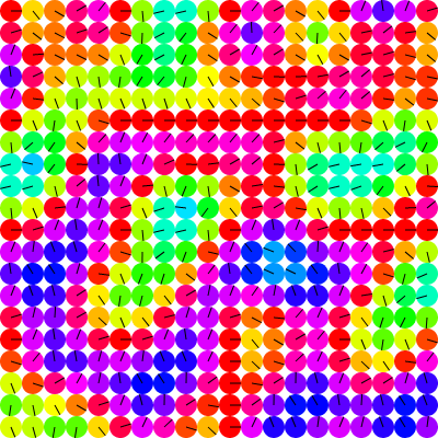
A common use case for Perlin Noise is to create some kind of flow field, and a common way to do that is to map the noise value at a particular location to an angle from 0 to PI * 2 radians (0-360 degrees). Above you can see an example of this. But there’s a problem with this logic. Can you see it in the above image?
The Problem
There’s a definite bias in the direction of all these vectors. They tend to point to the left. We can make this even more obvious by mapping each angle to a hue. We’ll use an HSV scheme so red will be both 0 and 360 degrees, cyan will be 180 degrees and the rest of the spectrum in between.

Here you can see that there is no red at all. The angles all basically point from almost due south, through west to due north. Nothing points to the east.
The first time I ran into this years ago, I thought there was some kind of bug in my own code. But it’s really just an attribute of Perlin noise.
Take this example of 1D Perlin noise.

My noise library returns values ranging from -1 to +1. Yours might use a range of 0 to 1, but the results will be similar. In this case, all the values lie between -0.5 and +0.5. This is pretty representative. Values can and will of course go higher and lower, but not often. It’s pretty rare that you’ll see values in the far end of that range.
Here’s another view of the “problem”:

Essentially a bell curve. So, you’re more likely to get values in the center range. If you’re simply mapping this to a range of 0-360 degrees, most of your angles are going to be from 90 to 270, which is exactly what we saw in the first couple of images.
Just above, I put the word, problem, in quotes. Before we go solving it, we should determine whether or not it needs to be solved. In many cases it just won’t matter. I have seen it become a problem mostly where I’m creating a flow field that influences the velocity of particles. After a while I notice all the particles are running right to left. Of course, you can mess with the angles and get them to run in a different direction, but there will always be a bias. If we don’t like that bias, then it’s a problem that needs fixing. Here’s an example that shows that exact use case:
The slider lets you change that bias, but that bias is always there.
Solution 1 – Multiply
The few times I’ve seen this problem addressed, the recommended solution is to multiply the range of the angle. Normally you’d be mapping -1 to +1 as 0 to 360 degrees. So people recommend mapping it to 0 to 720 instead. This seems to make sense because if our distribution remains what we’ve seen above, our values will be concentrated between 180 and 540, which is a range of 360 degrees, offset by 180 degrees. (I’m using degrees here because many find it easier to visualize than radians. But you’d be using radians in your code of course.)
OK, let’s take the second example above and map things that way.

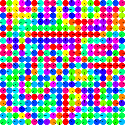
Well, we have some reds there, so that’s good. But perhaps too many reds. Not many at all pointing towards the west. Better than before, but not quite right. Let’s look at the distribution. Note that the distribution graph wraps values. So 370 degrees would be counted as 10 degrees.

Yup, better, but we still have some peaks on the left and right, and a valley in between. This explains the abundance of reds and lack of cyan. Or the bias towards heading east, to put it another way. And this bias holds true when we throw some particles down there:
Here we can see some particles head west now and then, but in general, they’re all going east (or whatever way we direct them with the offset slider). In other words, we haven’t totally solved the bias.
What if we raise the multiplier from 2 to 4. Map -1 to +1 to 0 to 1440 degrees? Here’s the distribution (again, wrapped):

Not exactly a uniform distribution. Now we have a bunch of peaks in there, but they’re all smaller. In general this looks promising. Let’s see how the particles deal with it.
Not bad. Based on the distribution graph, I’m guessing there’s a slight bias to the west, but it’s not super obvious in the particle simulation. But overall, things seem a lot more chaotic than the first version. (Using “chaotic” in the general sense of confusing changes, not strict chaos-theory-chaotic.) If we go back to our first vector/color visualization, we can see that clearly. The top one is when we mapped to 0 to 360, and below that is 0 to 1440.


Better color/angle distribution, but way more chaotic. To help handle this, we can change the scale of the Perlin noise. The above images are 800×800 pixels. For each “cell” in the above images, I’m taking the x, y location and multiplying it by 0.01 to get the values to feed into the Perlin noise function. In the following image, I moved that scale value down to 0.004.

Why 0.004? Just trial and error, looking for a value that would give me about the same noise scale as the original image. I initially thought that because I was multiplying the angle by four, I could divide the scale by four, and tried 0.0025, but that looked way too low. Trying 0.005 still looked a bit too noise, but 0.004 looked just about right. There’s probably some relationship there, but I didn’t try too hard to work out what it was. Let’s see how this looks with particles:
I’m fairly happy with this! I thew in another slider to let you explore other scale values. But let’s explore some other solutions.
Solution 2 – Change the Mapping
Let’s look back to the 1D Perlin noise graph:

Since most of our values lie within -0.5 to +0.5, we could try mapping that range to the output range 0 to 360 degrees.
I use my own mapping function that has a signature like this:
map(inputVal, inputMin, inputMax, outputMin, outputMax)
Given a Perlin noise value, n, and mapping to a range of 0 to PI * 2 radians, I use it like this:
angle = map(n, -1, 1, 0, Math.PI * 2);
Since we know n is usually going to be in -0.5 to +0.5, we can use that as our source range:
angle = map(n, -0.5, 0.5, 0, Math.PI * 2);
Before doing a distribution graph on this, I predicted that there would still be a bulge in the middle, but it wouldn’t go to 0 on the sides. Let’s see how I did…

Not bad. You might wonder about those times when n does go outside of the range of -0.5 to 0.5. It depends on your mapping function. If you have one that clamps output values to the output range, you will wind up with extra 0s and 360s in your output. My map function does not clamp, so if the input value is lower or higher than the input range, the output value will be correspondingly lower or higher than the output range. This works out well here, as -10 degrees, for example, is the same as 350 degrees.
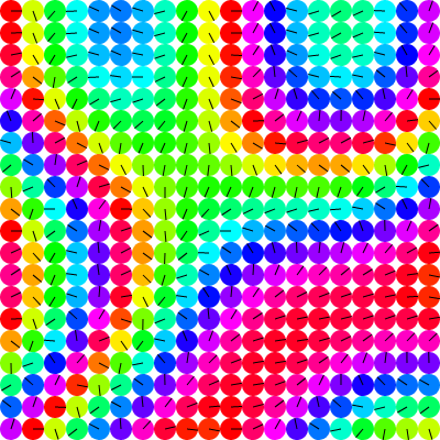
OK, but we still have a bias there. I won’t do a particle simulation because the bias is pretty obvious in the graph. But we can put it into the vector/color distribution.

In this case too, I got a pretty chaotic picture initially, even worse than with the multiply solution. I had to bring the scale down to 0.0025 to get the above image. And you can still plainly see the red bias there. So this is not really much of a solution as is. I could work on trying to “flatten the curve” but this is already departing from the simple solution I thought it was initially.
Other Ideas?
I had another hypothesis on how to deal with this situation.
The concept was to get one noise value from one area of the Perlin noise field, and another value from another part, perhaps using 3D Perlin noise. Now you have two random values ranging from -1 to +1. Using Math.atan2 on those two values will give you an angle, which should be pretty uniformly distributed between -180 and 180 degrees. And it kind of works:

The distribution is … ok? But tons of clumping and really hard transitions in some cases. Like in the bottom left when it goes from about 45 degrees (light orange) to around 225 degrees (dark blue). My guess is that those are both very low values like 0.00001 and 0.00001 and just a tiny, tiny change to each of them makes them go to something like -0.00001 and -0.00001. But that’s 180 degrees different in terms of angle. And near the bottom center there are four cells which point in almost four completely different directions. So I took this experiment as a failure.
I still feel like something might be possible with this general concept, but not very certain about it.
Summary
Early on I used to go for the remapping solution. Although the multiply solution is the one usually recommended (well, at least in the very few cases where anyone has mentioned this issue), I avoided it because of the chaos and the fact that it was still biased. Now I feel a lot better about it knowing you just have to multiply more and then scale down the noise.
It’s entirely possible I’m missing some other obvious solution as well.
And finally, it may be that I’m trying to make Perlin noise do something it’s not really designed to do. The question basically comes down to how to map Perlin noise values to a set of values with a uniform distribution. I’m not the first to ask the question (obvi). One example:
https://stackoverflow.com/questions/3696747/generation-of-uniformly-distributed-random-noise
Summary of summary: I might be overthinking this. The multiply by 4 and scale down solution does what I want it to do. Probably good to just go with this.
But if anyone has come across any other clever solutions, feel free to share.
Code
I know this post was pretty conceptual. Image and demo heavy, but not much code. So here’s a link to a repo that contains all the code I wrote to create all the images and demos.
Comments? Best way to shout at me is on Mastodon ![]()