MinimalComps2
Back in 2008, when Flash was still a thing, I created a set of UI controls called MinimalComps. A basic history of Flash UI controls starts with the ones that were included with Flash called “UIComponents” and later updated to “V2 Components”. Although most of the rest of the user interface world calls these things controls or ui elements or widgets, in Flash the name “components” caught on and stuck.
A lot of people created custom component sets. In 2004 I created a full featured set called “BitComponents” which I sold to a company called BeamJive. I always enjoyed making custom components, usually one off for specific needs, but in 2008, I set to work creating MinimalComps.
The idea behind MinimalComps was that they should be simple to create and use. Lots of people were doing Flash experiments and creating quick one-off apps and prototypes and proof-of-concept projects. Most existing component sets had all kinds of complicated styling and layout and data binding features which made them powerful, but gave them a bit of a learning curve. I wanted something where you could throw together a quick user interface without thinking much about it. One of the goals was to be able to create and configure most of the components in a single line of code. If you look at, say, a range slider type of component from that time, setting it up would go something like this:
var slider = new Slider();
slider.move(20, 20);
slider.value = 50;
slider.min = 0;
slider max = 100;
someParent.addChild(slider);
slider.addEventListener("change", someChangeHandler);
Up to seven lines of code to create a single slider. Some apps might have a dozen sliders. You’re getting up close to 100 lines of code just to create the sliders!
MinimalComps looked more like this:
var slider = new Slider(parent, 20, 20, 50, 0, 100, someChangeHandler);
With a signature something like:
new Slider(parent, x, y, value, min, max, handler);
I know that’s a lot of parameters, but when you’re making a lot of them, it become second nature and in the long run, 12 lines of code is better than 84 lines of code that does the same thing.
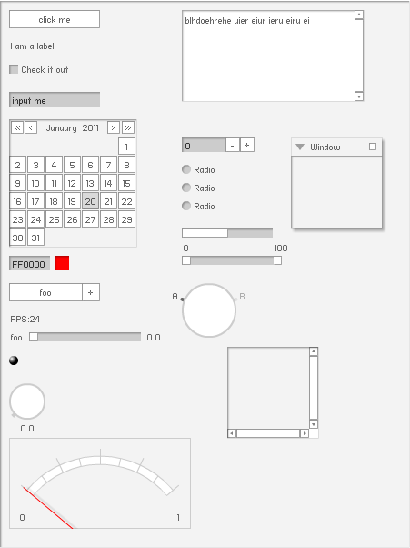
Here’s what they looked like, by the way:

And that’s all they really looked like. I did later add a dark theme, but beyond that there was no theming, styling, not a whole lot of customization possible. In spite of those limitations, they became wildly popular in the Flash community. I think the height of it all was this Adidas ad/video that featured MinimalComps.
“Featured” is a stretch, but they did appear for maybe two seconds total. 🙂

Anyway, getting carried away with nostalgia. It was a good time. And then Flash died. Everyone moved to Processing or Unity3D or WebGL or, like me, just straight up JavaScript and Canvas.
I made multiple attempts to port MinimalComps to HTML, both via Canvas and HTML/CSS/JavaScript. But back in 2011, things were pretty rough in terms of the state of all of those technologies. It was just kind of painful and I gave up each time.
Jump to 2021 and things have changed. JavaScript has classes and all kinds of other very neat features. HTML has Web Components (there’s that word again) and the Shadow DOM, and CSS is … well, CSS is still CSS, but it’s probably improved somewhat. Long story short, it’s actually possible to build some pretty cool stuff now. Like MinimalComps2.
So here they are
Yeah, so MinimalComps2 is a thing now. I’ve been obsessed with it for the last several weeks. The Web Components / Shadow DOM technology has made this a lot easier. The goal was always to be able to just add a single library to your app and have all the components there. Not add multiple libraries plus CSS files, configure some kind of bundler, rely on some specific framework, etc. You can just throw the library in a script tag in your HTML file, or access it as a JS Module.
No complex layout system. Just give each component an x, y coordinate. Generally, you’ll first create a Panel component that serves as the parent and visually contains the rest of the UI, but it’s not required.
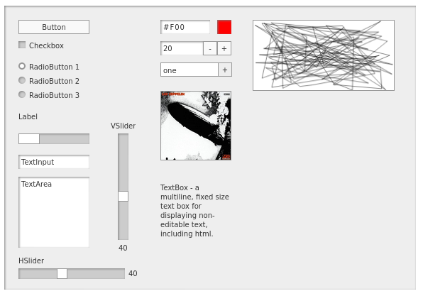
Oh, and here’s what they look like:

As you can see, I tried to stick to the original aesthetic (or lack thereof maybe). I did make some elements a bit larger (because of my eyes not being what they were 13 years ago?) but they can be made smaller if you’re into the whole barely visible thing.
Most of these components are brand new and 100% custom. Which is to say that the Button component is not a styled HTML button. Checkboxes, RadioButtons, Sliders, Dropdown, NumericStepper and ColorChooser are also built from the ground up. Why? Have you ever tried to do a custom style for a checkbox, radio button or range slider? And make it work on all platforms and browsers? It’s a CSS nightmare. I’m not saying it was easy to create these things from scratch rather than relying on existing elements, but it was a lot more fun and a lot less frustrating. And I could customize them in ways that would not really be possible across all platforms. For example, Firefox does not even support vertical range sliders. You have to hack it together with CSS rotation transforms. Same for reverse sliders where the max value is on the left or bottom and min is on the top or right. Not supported at all in HTML. Was very straightforward in a custom slider.
I was even able to implement focus indicators, tab navigation and keyboard activation for all the interactive components. I’m not saying they are fully accessible, but there is some progress there. They also work on the mobile browsers I’ve tried. It’s not a great experience on mobile to be honest, but basic functionality seems to be there.
More info
If you want to learn more about MinimalComps2, read the docs, see a bunch of live demos, head over to the site (sorry, no longer exists)!
And if you want to get the libraries themselves (one for global/script tag, one for JS modules) head over to the github repo: https://github.com/bit101/minimalcomps2
I’ll have more info here as things evolve. Hoping to get some small fraction of the excitement over these that the original version had!
Comments? Best way to shout at me is on Mastodon ![]()